• Café Life is the Colony's main hangout, watering hole and meeting point.

    This is a place where you'll meet and make writing friends, and indulge in stratospherically-elevated wit or barometrically low humour.

    Some Colonists pop in religiously every day before or after work. Others we see here less regularly, but all are equally welcome. Two important grounds rules…

    • Don't give offence
    • Don't take offence

    We now allow political discussion, but strongly suggest it takes place in the Steam Room, which is a private sub-forum within Café Life. It’s only accessible to Full Members.

    You can dismiss this notice by clicking the "x" box

The New Test Site Is Open – Your Comments Will Be Appreciated!

Status
Not open for further replies.
We therefore have two options for the new default home page:

a) forum list; or
b) latests posts.

It’s not really quite as polarising as that, because whichever option is chosen, people can simply click a large button (either “New Posts” or “Forum List”) to select their favourite home page view. Also, if the default home page doesn’t suit a member, then they can simply bookmark the other option and they’ll never be troubled with the wrong view when they initially visit the site.

There is a further option I need to mention to you – click the “Forum List” button view, then scroll down to the bottom of the page. You’ll see a new option there that says “Toggle Sidebar”, try it.

So… members can have as the default home page…
  • Forum view without sidebar
  • Forum view with sidebar
  • Latest posts view without sidebar
  • Latest posts view with sidebar
In other words, four options. Plus of course, light and dark :)

All these options will need careful explaining, I’m thinking about how to do that now.

The key question, though, is what view do we set as default for non-members, i.e. folk who have just discovered the site for the first time?

I can see valid arguments for either Forum View or Latest Posts View.
 
four options
Nice.

As for the first-timers landing here, constant flux is certainly trendy. But then...

Holmes turned with a flourish of his pipe and ejaculated, "I've got it, Watson! This wasn't murder at all. This man died of flux." He sniffed the air. "Constant flux, if I'm not mistaken."​

:)

[I'm being silly. Don't read too much into Sherlock's remarks.]
 
Hmm, sorry to be contrary, but I don't like it. I prefer a forum homepage where I can scroll around and see which subforums have new posts and, over time, build up a sense of which subforums are most active -- that's to say, I like the basic idea behind the way the live site is now.

And also, and again forgive me for being contrary, but I don't think Litopia is a "social media" site. It's a forum. There's a difference.
I'm with you. I prefer the forum homepage.
 
I love all these new features.

The sub-menus are great, very clear and easy to navigate. Love the "My Stuff" page! Woohoo! I also really like that the alerts will be easier to read now, as part of "My Stuff" (instead of squished up) and profiles are easy to see/update. I like the home page with just new posts. You can always go to the forum page to see everything. Makes more sense to me to give an option of how to access the info, rather than two of the same pages.

Great updates!
 
Sorry to be contrary, and I know you will NEVER please everyone, but if I clicked on this (the test site configured to display just new posts on the home page), I would click straight back off again. I go on a writing site to engage with writing, not to see innumerable "new" posts from people I don't know. I liked seeing the various options (critiquing, books, craft etc) because that told me I was in a writing space. A list of new posts doesn't tell me anything. In that sense, no, it's not useful—it's a complete turn-off. It kind of begs the question: "what is this site about?" Are we about "new" posts or are we about writing? Are we about socialising, or writing? Both, probably. But—for me at least—writing comes first.

I liked the two examples LA Thomas gave, the business and accounting ones, purely because of the visuals. They work for me. But I'm guessing that's not where you want to go—which is fine.

I agree with Rich. I prefer a forum page I can scroll around etc.
 
I think it's fantastic that we will be able to choose the look and feel of the homepage for ourselves. The divide in opinions appears to be old school forum users vs social flux types. The challenge as Pete said is to set the right default to attract newcomers. So I guess it comes down to market: do more new members come from a forum background? Or are they used to social media feeds with 'latest news' at the top?
 
We therefore have two options for the new default home page:

a) forum list; or
b) latests posts.

It’s not really quite as polarising as that, because whichever option is chosen, people can simply click a large button (either “New Posts” or “Forum List”) to select their favourite home page view. Also, if the default home page doesn’t suit a member, then they can simply bookmark the other option and they’ll never be troubled with the wrong view when they initially visit the site.

There is a further option I need to mention to you – click the “Forum List” button view, then scroll down to the bottom of the page. You’ll see a new option there that says “Toggle Sidebar”, try it.

So… members can have as the default home page…
  • Forum view without sidebar
  • Forum view with sidebar
  • Latest posts view without sidebar
  • Latest posts view with sidebar
In other words, four options. Plus of course, light and dark :)

All these options will need careful explaining, I’m thinking about how to do that now.

The key question, though, is what view do we set as default for non-members, i.e. folk who have just discovered the site for the first time?

I can see valid arguments for either Forum View or Latest Posts Vie

I think it's fantastic that we will be able to choose the look and feel of the homepage for ourselves. The divide in opinions appears to be old school forum users vs social flux types. The challenge as Pete said is to set the right default to attract newcomers. So I guess it comes down to market: do more new members come from a forum background? Or are they used to social media feeds with 'latest news' at the top?
Personally, I'm happy to see new posts and click on the Forums link to see everything else, however I can understand that new people may prefer to have the categories displayed more overtly, straight away. I just thought that the page looked simpler and less intimidating with new posts versus the more crowded Forums, but I can see both sides of the argument! I'm glad I'm not in @AgentPete 's shoes!
 
I think it's fantastic that we will be able to choose the look and feel of the homepage for ourselves. The divide in opinions appears to be old school forum users vs social flux types. The challenge as Pete said is to set the right default to attract newcomers. So I guess it comes down to market: do more new members come from a forum background? Or are they used to social media feeds with 'latest news' at the top?
I laughed aloud at "social flux"! I'll file that one away for later use. You may be right, Mel, about the divide between old and new skools and to what type of noob the homepage is aimed at, but I wonder if there is a deeper issue here about what type of site this is. I mentioned earlier in this thread that there is a difference between a social media site and a forum, and by that I meant, specifically, that social media sites tend to be governed by algorithms designed to entrap, whereas forums are governed by people for the benefit of their community. The latter seems more in keeping with Litopia's philosophy.

Over to you, @AgentPete. What is Litopia? Answer that and perhaps form will follow function.

[There may be, of course, a novel solution. I'm not arguing against evolution!]

Rich, I saw your earlier comment and in fact my use of 'flux' was a nod to it! ;) I didn't reply then as not wanting to stir the pot, but I did immediately check the definition of social media and found that, at least in technical terms, forums are considered under the same umbrella as other social sites. In the end, they are all networks, right? We post and share and comment. But clearly, Litopia is no algorithm-driven beast trying to manipulate us (if it ever became that way, I'd sure be outta here fast!)
Either way, I'm glad the site is evolving to better reflect different users' preferences. I think that what we're seeing is pretty novel, and an evolution.
 
Last edited:
Sorry to be contrary, and I know you will NEVER please everyone, but if I clicked on this (the test site configured to display just new posts on the home page), I would click straight back off again. I go on a writing site to engage with writing, not to see innumerable "new" posts from people I don't know. I liked seeing the various options (critiquing, books, craft etc) because that told me I was in a writing space. A list of new posts doesn't tell me anything. In that sense, no, it's not useful—it's a complete turn-off. It kind of begs the question: "what is this site about?" Are we about "new" posts or are we about writing? Are we about socialising, or writing? Both, probably. But—for me at least—writing comes first.

I liked the two examples LA Thomas gave, the business and accounting ones, purely because of the visuals. They work for me. But I'm guessing that's not where you want to go—which is fine.

I agree with Rich. I prefer a forum page I can scroll around etc.
My feeling atm is to try the Latest Posts page as the default for new users, but to also include a sidebar that gives a bit more of an overview to the site structure. Hedging my bets a bit. The sidebar can be turned off by the user at any point, of course.

We’ll see quite quickly what impact that has on visitors and membership.

I’ve had to go through quite a lot of mental adjustment to arrive at that answer. I found it hard initially to understand why folk wouldn’t want to take in an instant overview of everything the site has to offer. However, I realized that I was seeing it from my own pov, and not necessarily that of a newcomer. I’m deeply involved in the site (re)structure, so that’s what I wanted folk to see – and like. But people don’t admire and invest in structure. They relate to other folk (cookie lesson, anyone?). Letting them see what sort of real, person-to-person conversations happen here is the acid test. That’s what they’re about to get involved with. If they don’t like the conversations here… they won’t like Litopia. End of.

Of course, it does rather imply that our conversations here should, at least, have, er, interesting titles… :)


I laughed aloud at "social flux"! I'll file that one away for later use. You may be right, Mel, about the divide between old and new skools and to what type of noob the homepage is aimed at, but I wonder if there is a deeper issue here about what type of site this is. I mentioned earlier in this thread that there is a difference between a social media site and a forum, and by that I meant, specifically, that social media sites tend to be governed by algorithms designed to entrap, whereas forums are governed by people for the benefit of their community. The latter seems more in keeping with Litopia's philosophy.

Over to you, @AgentPete. What is Litopia? Answer that and perhaps form will follow function.

[There may be, of course, a novel solution. I'm not arguing against evolution!]
Dare I say, Litopia is in a state of flux :)

Which really only reflects what’s happening in the wider publishing world.

I utterly deplore what’s happening to commercial publishing’s mid-list. We’re turning into a dull, profit-driven media operation. Couldn’t care less about tentpole IP and it’s endless iterations. Judging by the public’s reaction to, oh, The Flash neither do the punters, either.

So we’re at a crossroads in the publishing industry.

Traditional publishing will continue, and many writers will still want to go that route. We will serve them.

Self-publishing is in the ascendant. Challenging in every way, but oh so rewarding when it goes well. We must develop expertise here.

And then… there are just people who want to write. They may not have business goals. They love the medium and its infinite potential. Without them, we’d have no heart or soul, so we must be a good home for them, too.

Tall order, huh :)


Rich, I saw your earlier comment and in fact my use of 'flux' was a nod to it! ;) I didn't reply then as not wanting to stir the pot, but I did immediately check the definition of social media and found that, at least in technical terms, forums are considered under the same umbrella as other social sites. In the end, they are all networks, right? We post and share and comment. But clearly, Litopia is no algorithm-driven beast trying to manipulate us (if it ever became that way, I'd sure be outta here fast!)
Either way, I'm glad the site is evolving to better reflect different users' preferences. I think that what we're seeing is pretty novel, and an evolution.
Well said :)
 
What is Litopia?
.... and what type of members you wish to attract. 'Transient' folk? Or 'long term folk who participate'?

I wonder whether the long term type are more inclined to investigate and put the effort in to explore what's here.

There's probably a middle ground somewhere.

But I'm an old fogey who lives in a cave. I write my work on stone walls.
 
.... and what type of members you wish to attract. 'Transient' folk? Or 'long term folk who participate'?
I’ve pondered this quite a bit, but don’t have any useful conclusions. I don’t actually think there’s such a thing as a writing “type”. There are probably some attributes that are a bit more common than others. But I’m not sure there are many useful generalisations.

One thing that won’t comes as a surprise is that writers do tend to be more towards the introverted end of the spectrum. Most writing isn’t collaborative, rather monastic in lifestyle, in fact.

I’ve always wanted Litopia to counteract that. The first hurdle to cross is to understand that most of the time, most writers aren’t actually in competition with each other at all. We have a lot more to gain by collaborating, in the broadest sense, than we do from living in isolation.

I wonder whether the long term type are more inclined to investigate and put the effort in to explore what's here.
I just don’t know… we’ll find out. Also, folk will circulate in and out, sometimes on quite a long cycle. Apparently, there’s life outside of Litopia… And it happens to folk, sometimes! :)
But I'm an old fogey who lives in a cave. I write my work on stone walls.
Ah, a prepper! We’ll all be like that soon!

Missed you in Huddles, btw :)
 
"But people don’t admire and invest in structure. They relate to other folk (cookie lesson, anyone?)."
Couldn’t care less about tentpole IP and it’s endless iterations. Judging by the public’s reaction to, oh, The Flash neither do the punters, either.
I'd say a lack of investing in folk is possibly the main reason for The Flash's poor box office takings. Ezra Millar was a blinkered casting. And I don't think, after a certain high profile court case, that the giant, chuckling Aquaman, popular as he is, is going to save his sequel from a similar drowning.

So yes, I suppose newbies will be looking at the who and not just the how. I do like the idea of their first perusal including the sidebar though. I think it's good to see that we are not just a social site, a bunch of talking heads.
 
From what I can tell, the question is more about what the home page should be, specifically for new people? Because the forum page is still there, just not as the home page anymore. It could be that the current home page is renamed to "Latest Posts" or something, and there could be a more general "home page" that's more of a simple "about us" page, for new people to see at a glance what the site has to offer, ethos, etc, along with a menu that you can navigate to all the different parts. It could be good to have a home page as an introduction to the Litopia writer's community site (which is how I see it), instead of into the thick of it.

Just a thought?
"About us" is always what I initially look at on any new website I visit.
 
I did immediately check the definition of social media and found that, at least in technical terms, forums are considered under the same umbrella as other social sites. In the end, they are all networks, right?
Yes, they are, in the same way that, technically, speech comes under the umbrella of noise. ;)

I'm glad the site is evolving to better reflect different users' preferences.
I completely agree!

Dare I say, Litopia is in a state of flux :)
Litopia, publishing, the world! Can't move for the flux :) Seriously though, you've a mighty task on your hands and it's great to see how inclusive you're aiming to be and, as always, how considered you are. I'm loving the intent to develop self-publishing expertise.

"About us" is always what I initially look at on any new website I visit.
Me too, in fact, almost always, though I hadn't made that self reflection until I read your comment.
 
I really like the dark mode. Makes me feel kind of villanous.
Overall, I am not a fan of change. I really want the kids to stay off my lawn.
But the new site works just as well for me.
I really like the dark mode. Makes me feel kind of villainous.

I really like the dark of a hobbit hole. Makes me feel like a hobbit thief about to go on an adventure.
 
I went to the new test site and all I saw was a list of hellos from new people. OK... that is not really what I want from Litopia. I feel a certain obligation to welcome newbies and will do so to grow and enrich the colony, but that's not what I pay my subscription for. Nor do I think newbies will stay to meet other newbies.
I want to see what the buzz is in the colony. Any new WIP. Any new inspirational videos. Any new insights from the publishing world. This REALLY does not work for me. I don't want a social media site I want a site that moves me forward on my writing career and this definitely is NOT how I would chose to find writing partners.

I'm going to have to see WIP samples and exchange philosophies before I commit to critiquing or beta reading with another Litopian. I prefer the idea of Litopia being an area where writing pods can form. For that you need a forum where actual ideas are exchanged. It's the ideas that bring me to Litopia -not the people. There are other writing groups for the usual thing. I want the UN-usual.

The cleaner page is less attractive to me, but I like complexity. I know I was also very confused in the beginning so I can see where the learning curve to where a new user can really begin using the site, needs to shorten. But if I had come to find nothing but a list of hellos? I'd have just judged Litopia another site looking to make money off writers by selling the same old same old.

White text is as easily visible to me as dead loved ones. My eyes don't even catch on it.
 
Last edited:
I went to the new test site and all I saw was a list of hellos from new people. OK... that is not really what I want from Litopia. I feel a certain obligation to welcome newbies and will do so to grow and enrich the colony, but that's not what I pay my subscription for. Nor do I think newbies will stay to meet other newbies.
I want to see what the buzz is in the colony. Any new WIP. Any new inspirational videos. Any new insights from the publishing world. This REALLY does not work for me. I don't want a social media site I want a site that moves me forward on my writing career and this definitely is NOT how I would chose to find writing partners.

Couple of questions...

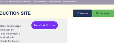
You can now define how you want the home page to be. Not sure if you realized that? Click on the big "Forum List" button and it will present itself as it currently does:
Screenshot 2023-06-23 at 11-27-43 TEST Litopia TEST NON-PRODUCTION SITE.png

Also, you have the option to turn on / turn off the sidebar. ON gives more content on the page. OFF makes it less cluttered. Scroll to the bottom and click "Toggle Sidebar":
Screenshot 2023-06-23 at 11-29-57 Forum list.png

This is sticky, i.e. it will remember your preference between visits.


I'm going to have to see WIP samples and exchange philosophies before I commit to critiquing or beta reading with another Litopian. I prefer the idea of Litopia being an area where writing pods can form. For that you need a forum where actual ideas are exchanged. It's the ideas that bring me to Litopia -not the people. There are other writing groups for the usual thing. I want the UN-usual.
Just to be clear, is that Cafe Life or would you prefer this to be an additional function within The Laboratory (renamed Workshops)?


The cleaner page is less attractive to me, but I like complexity. I know I was also very confused in the beginning so I can see where the learning curve to where a new user can really begin using the site, needs to shorten. But if I had come to find nothing but a list of hellos? I'd have just judged Litopia another site looking to make money off writers by selling the same old same old.
Try Forum View as the default then toggle the sidebar to "ON". It looks pretty similar to what we currently have.
 
Couple of questions...

You can now define how you want the home page to be. Not sure if you realized that? Click on the big "Forum List" button and it will present itself as it currently does:
View attachment 15809

Also, you have the option to turn on / turn off the sidebar. ON gives more content on the page. OFF makes it less cluttered. Scroll to the bottom and click "Toggle Sidebar":
View attachment 15810

This is sticky, i.e. it will remember your preference between visits.


Just to be clear, is that Cafe Life or would you prefer this to be an additional function within The Laboratory (renamed Workshops)?


Try Forum View as the default then toggle the sidebar to "ON". It looks pretty similar to what we currently have.
The white text makes other options hard for me to see. So no. I didnt see that.

And I'm not sure that if it were my first visit I wouldn't make the judgment that it wasn't for me before finding that option. Maybe take out the new members joining? Have those go into a separate 'Who's new'? I do go to the What's New button on the present site after I've checked forums and alarms.

I think definitely an additional function within Laboratory. ( I prefer the label to workshops. Maybe because workshops have been cliched to death so that I connect them with people trying to sell me stuff.) Maybe experiment with a classified sort of Craigs List place. " YA Fantasy Fiction writer looking for mutual support partners for weekly zoom about WIP." "Looking for anyone wanting to practice their storytelling on a zoom call. Weekly virtual prize for best story told."


Again that white text, like ghosts in the dark. It's nice I can chose between Forum or What's new. But the choice would be easier if the "what's New" wasn't full of hellos that make me feel guilty if I dont answer.

I belong to a closed writers group as well as Litopia. From that group I get really good industry updates, competitions, Twitter and other social media happenings, marketing discussions etc. New members are allowed in only once or possibly twice a year so the problem of people joining just to exploit free critiques is eliminated. I stay in because it is still useful to me. However, it lacks whatever it is that Litopia has. Critiques are limited to 400 words a week-pretty useless in my view unless it's blurb or synopsis. There is more superficial connection, but less real. In my mind therefore less creativity. Both groups are very much meant to get published, but I would say Litopia generates more honest creativity. Still working out how.
 
Last edited:
The white text makes other options hard for me to see. So no. I didnt see that.
Change the day/night option at the top, PJ. Once you've selected the option you want, it will remember your choice between visits... it's the little "moon" icon here:

Screenshot 2023-06-23 at 14-43-08 TEST Litopia TEST NON-PRODUCTION SITE.png

And I'm not sure that if it were my first visit I wouldn't make the judgment that it wasn't for me before finding that option. Maybe take out the new members joining? Have those go into a separate 'Who's new'? I do go to the What's New button on the present site after I've checked forums and alarms.
Yeah, we can titrate that once the production site is running with the new layout. Because the test site is “frozen” in time you’re not seeing much else apart from a load of intros.

I think definitely an additional function within Laboratory. ( I prefer the label to workshops. Maybe because workshops have been cliched to death so that I connect them with people trying to sell me stuff.) Maybe experiment with a classified sort of Craigs List place. " YA Fantasy Fiction writer looking for mutual support partners for weekly zoom about WIP." "Looking for anyone wanting to practice their storytelling on a zoom call. Weekly virtual prize for best story told."
I have to phase things a bit… first, I want to get the new look up and running OK on the main site. Next, I’ll look at new member induction. Then I’ll revise / improve working procedures in the Laboratory. :)

Again that white text, like ghosts in the dark. It's nice I can chose between Forum or What's new. But the choice would be easier if the "what's New" wasn't full of hellos that make me feel guilty if I dont answer.
Hit the light/dark button...
 
I appreciate the cleaner look. Also enjoy the fact that we can toggle from light to dark mode. Also appreciate eliminating the various new, latest posts, what's new, recent activity confusion (IMO)
 
Hmm, sorry to be contrary, but I don't like it.
I'm very much with you. I don't like it.

Nothing against new members – but if I've understood it right, the site opens with them now, which doesn't show the breadth of the other content ('the offer', if you like) in any way. If it stays like that, it'll feel like hard work for me.
 
I'm very much with you. I don't like it.

Nothing against new members – but if I've understood it right, the site opens with them now, which doesn't show the breadth of the other content ('the offer', if you like) in any way. If it stays like that, it'll feel like hard work for me.
Pete says you can change it so it opens with Forum, which is fine, but I still think there needs to be a separate place for "Who's New." And if I came for the first time I would probably go away wo exploring for that option to change for Forum. After all I wouldnt even know it was there.
 
I don't have any significant comment on the new site. It looks to be there, thereabouts or fairly close to what I'm looking for. I like the idea of zipping between 'forum list' and 'latest posts' as and when the spirit moves me. On the one hand, it needs to be an obvious writer's site with a list of the various forums and resources available... but also, I like to interact in cyberspace with those of a creative mind... writers and poets in particular... so it's good to see latest posts/outpourings/thoughts/profile updates/triumphs/tragedies/etc. I'm very grateful for the increase in the number of 'profile update' characters to 750. Updating me jolly olde profile is one of my main creative outlets at the moment. I'll enjoy the discipline of keeping within that 750 characters.

Thanks for everything everybody does to keep the site vibrant and thanks for having me. I'm hoping to increase my contribution as life unfolds in all it's glory and gory.
 
Re @Hannah F's post on her profile (about missing the 'like' button in the new Lab. - My response is too long for the box there, so I'm posting here.)

I agree.

While I get why the 'like, love, haha, etc' buttons have been removed there, I do wonder whether they were more useful than not. I don't think they were damaging in any way. Actually now they're gone, I realise they were super useful both when giving and receiving feedback.

1) They were a good way of giving someone a quick nod (esp after a rewrite) to tell them that they're on the right track now.

2) They showed an instant gut reaction. "Yes!"

3) They told me that someone has read my post and has given it a thought, and that they have nothing to add further. It made me feel 'heard', less 'lonely', and that I'm not talking-to-the-wall-hellooo-is-anyone-out-there-actually-reading-this. (Esp in the Writing Accountability Thread where we simply post what we've been up to. It's nice there to have an acknowledgement that someone is there 'with us'.)

4) The distinction between "like", "love" and "haha" was also useful because again, it shows a gut reaction.

Maybe it's too soon to say bring them back @AgentPete? But I don't think Litopians are of the social-media-"like"-hunter type. It's nice to have the option to just click 'like' without having to write it in a box (and no, I'm not lazy. Ok I am. :D ) , esp when I'm super busy and am doing things between things, and also when I visit the site using the phone.... But mainly because of my points above. I think they can be a useful part of the Lab.
 
Last edited:
We don’t have the ability to restrict certain reactions to specific forums, unfortunately. It’s all or nothing. Which means that some of the sillier reactions (uh, the ones I tend to use…) will be equally available in the Lab as in CL. It’s up to members’ good sense as to what’s appropriate.

I’d like to leave it a week or two, allowing everyone to form a view, then perhaps you'd like to start a poll in CL to decide?

:) p.
 
Status
Not open for further replies.
Back
Top