I’m delighted to say that, after working through so much helpful feedback, the new test site for the Colony is open for your comments. Thank you again to everyone who took pains to contribute their highly appreciated thoughts.
Here’s the link:
You can log in using your existing name and password. And you can make posts etc just as you would normally do here. However, please note:
IT’S A TEST SITE!
It will be deleted in a few days, when any posts, messages, uploads etc you may have made there WILL ALSO BE DELETED!
Please don’t confuse the test site with the main one (here).
Lots of points to cover. Please read the below as you peruse.
HOME PAGE
ARCHIVING
Threads in Cafe Life will now auto-close 45 days after the last live post is made. Let me know how this works, and whether the number of days needs to be changed. I did consider setting up new archive sub-forums, but moving threads to and from might be problematic. Keep old threads in their originating forum makes more sense. Locked threads can be resurrected if a Guardian is asked.
NEW MEMBERS
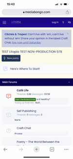
Still working on the new member initiations rituals If you log out, and then go to the Home page, you’ll see a new section appear – “Here’s Where To Start”. This will be developed shortly, and will display to every new member until they’ve made 30 posts. The aim is to cover many of the great points made in the Suggestions thread, e.g. how to create a profile, write a hello post, etc etc.
There is another idea that I’m keen to develop, which is “Litopia Angel” or “Litopia Parent”… a small team of folk who take new members under their wings for approx the first month, show them the ropes etc. This is not yet implemented, but I’d like to.
While talking about membership, we will soon be moving membership processing (joining, renewing etc) off the Colony site and onto the main Litopia.com site. This will give us far more flexibility to create special offers, etc.
THE WORKSHOPS
Renamed – the main section is now “Critiques, Beta-Readers & More” which is far more explanatory, and the forum itself is now “The Laboratory” which avoids puzzling members who may think “workshop” means seminar.
Like reactions in The Laboratory have been removed.
The Laboratory will still be open to all members Basic or Full. However, a time & posting test will be applied, to avoid seagulls swooping in, getting a tasty crit and leaving on the next boat. New members will not be able to use The Laboratory until they’ve been here for 3 days and have posted 5 times. Let me know how this works.
Our system of critiquing. Many nice comments on this, thank you I will be developing the system here to make it more functional and give new members in particular a very clear steer to use our system, and not start pretending to be a writing coach. More on this in the next few weeks.
Points system… I feel this is simply too complex, and risks detracting from a single-minded focus on our unique system. Will expand to include ancillary writing such as blurbs.
BOOK RECOMMENDATIONS
We already have a sticky thread in Cafe Life called “What Are You Reading?” but in addition, there’s now a new Prefix called “Book Recommendation” for you to use when starting a new thread specifically to recommend one particular book that’s impressed you.
WRITING SUCCESSES
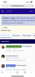
I agree we need to celebrate our successes – even minor ones – more than we do. We already have a “Fanfare” prefix in Cafe Life which isn’t quite enough, and currently is used for… well, anything. We need a new prefix – ideas, please. At that point, any posts in Cafe Life with that magical prefix will automatically picked picked up and featured on the home page. You can see this working on the test site at the moment, it’s picking up any post with a “fanfare” prefix.
MEMBERS PROFILES
Various new fields added as suggested (optional for member to complete).
BOOKMARKS
Several members have complained that they can’t easily find posts that they find interesting once they’ve moved away from them. We actually do have a “Bookmark” system in place, although you may not easily see it. At the top of each post, on the same line as the post number (#1, #2 etc) you’ll see a couple of small icons – the first one is a social share button that lets’ you share the post on other social media. The second icon – like a bookmark – let’s you create your own bookmark that’s saved in your list of bookmarks. Click on your own name in the top menu bar and you’ll see the list of bookmarks right there. Hope that’s clear.
HASHTAG
We already have a tagging system in place. However, tags seem a throwback to a previous Web 2.0 era. If folk find them useful, we can certainly enhance the tagging system a lot more. Let me know.
AND OTHER OFF-COLONY STUFF…
Twitter
I’d be delighted if someone / or some people would volunteer to look after our Twitter account. I simply can’t do this myself, other than posting Pop-Up updates. But it might be fun for someone else to do.
Huddles
Scheduling is always a problem for live events if you’re working across multiple time zones. That’s why we tend to focus them at weekends, the idea being that 5pm UK is 9am west coast… still not terribly convenient, but better than 9am on a weekday which many would find impossible because of work commitments. Always open to suggestions.
Pop-Ups
There was a comment about participating but not feeling appreciated… I really do try to thank everyone in the Genius Room, and I try to read out as many comments as possible. If you can think of anything else I can do, please don’t hesitate to tell me.
Mastodon
Litopia will always be an experimental community inasmuch as we will try new things first before others do. EG podcasts, etc. Some will work, some won’t, but all will give us knowledge. Will keep the mastodon server going until at least the end of this year, then will consult with members.
Weekly Zoom meetings
We use Zoom for Huddles and the Book Club, but I’m more than happy to make it available for members to hold other meetups… again, just let me know if you’d like to organise something. The initiative rests with you to decide what you’d like to see… e.g. genre-specific meetups.
Image Compression
We now use a different algo, please let me know if the over-compression is still a visible problem.
Here’s the link:
https://www.mediabongo.com/
You can log in using your existing name and password. And you can make posts etc just as you would normally do here. However, please note:
IT’S A TEST SITE!
It will be deleted in a few days, when any posts, messages, uploads etc you may have made there WILL ALSO BE DELETED!
Please don’t confuse the test site with the main one (here).
Lots of points to cover. Please read the below as you peruse.
HOME PAGE
- The design, colors etc are obviously similar… no point in change for change's sake unless there’s a good reason.
- There is now a light / dark “switch” on the top menu bar (the moon icon). This has been a much-requested feature. Please let me know how the dark mode works for you, we can tweak it if necessary.
- Each main section (“main Forums” etc) is now shrinkable. This means that you can click the little triangle icon on the section bar to hide its contents and make the page less confusing / cluttering. A number of people have commented on the baffling number of options on the home page, this is one way to make it look more manageable.
- New members’ orientation: still a work in progress. I want to get the new site up and running first, then this and other WIPs as below will be added.
- Maximum profile message length now 750 characters (was 420)
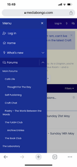
- Writers’ Room now merged with Cafe Life. CL has always been our main community area and dividing discussions into writing / non-writing forums isn’t particularly clear or logical.
- New forum – Self Publishing. In truth, there’s more crossover between “trad” publishing and self-pub than you might think, so this will also be the forum for us to discuss such topics as book marketing, author promotion etc. You don’t needs to be a card-carrying self-publisher to take part

- SIGs – never quite hit their mark. May try again in future in a slightly different way.
- The Book Club will now have its own dedicated main-area forum – if there are any other SIGs that need to be carried over, let me know.
ARCHIVING
Threads in Cafe Life will now auto-close 45 days after the last live post is made. Let me know how this works, and whether the number of days needs to be changed. I did consider setting up new archive sub-forums, but moving threads to and from might be problematic. Keep old threads in their originating forum makes more sense. Locked threads can be resurrected if a Guardian is asked.
NEW MEMBERS
Still working on the new member initiations rituals
There is another idea that I’m keen to develop, which is “Litopia Angel” or “Litopia Parent”… a small team of folk who take new members under their wings for approx the first month, show them the ropes etc. This is not yet implemented, but I’d like to.
While talking about membership, we will soon be moving membership processing (joining, renewing etc) off the Colony site and onto the main Litopia.com site. This will give us far more flexibility to create special offers, etc.
THE WORKSHOPS
Renamed – the main section is now “Critiques, Beta-Readers & More” which is far more explanatory, and the forum itself is now “The Laboratory” which avoids puzzling members who may think “workshop” means seminar.
Like reactions in The Laboratory have been removed.
The Laboratory will still be open to all members Basic or Full. However, a time & posting test will be applied, to avoid seagulls swooping in, getting a tasty crit and leaving on the next boat. New members will not be able to use The Laboratory until they’ve been here for 3 days and have posted 5 times. Let me know how this works.
Our system of critiquing. Many nice comments on this, thank you
Points system… I feel this is simply too complex, and risks detracting from a single-minded focus on our unique system. Will expand to include ancillary writing such as blurbs.
BOOK RECOMMENDATIONS
We already have a sticky thread in Cafe Life called “What Are You Reading?” but in addition, there’s now a new Prefix called “Book Recommendation” for you to use when starting a new thread specifically to recommend one particular book that’s impressed you.
WRITING SUCCESSES
I agree we need to celebrate our successes – even minor ones – more than we do. We already have a “Fanfare” prefix in Cafe Life which isn’t quite enough, and currently is used for… well, anything. We need a new prefix – ideas, please. At that point, any posts in Cafe Life with that magical prefix will automatically picked picked up and featured on the home page. You can see this working on the test site at the moment, it’s picking up any post with a “fanfare” prefix.
MEMBERS PROFILES
Various new fields added as suggested (optional for member to complete).
BOOKMARKS
Several members have complained that they can’t easily find posts that they find interesting once they’ve moved away from them. We actually do have a “Bookmark” system in place, although you may not easily see it. At the top of each post, on the same line as the post number (#1, #2 etc) you’ll see a couple of small icons – the first one is a social share button that lets’ you share the post on other social media. The second icon – like a bookmark – let’s you create your own bookmark that’s saved in your list of bookmarks. Click on your own name in the top menu bar and you’ll see the list of bookmarks right there. Hope that’s clear.
HASHTAG
We already have a tagging system in place. However, tags seem a throwback to a previous Web 2.0 era. If folk find them useful, we can certainly enhance the tagging system a lot more. Let me know.
AND OTHER OFF-COLONY STUFF…
I’d be delighted if someone / or some people would volunteer to look after our Twitter account. I simply can’t do this myself, other than posting Pop-Up updates. But it might be fun for someone else to do.
Huddles
Scheduling is always a problem for live events if you’re working across multiple time zones. That’s why we tend to focus them at weekends, the idea being that 5pm UK is 9am west coast… still not terribly convenient, but better than 9am on a weekday which many would find impossible because of work commitments. Always open to suggestions.
Pop-Ups
There was a comment about participating but not feeling appreciated… I really do try to thank everyone in the Genius Room, and I try to read out as many comments as possible. If you can think of anything else I can do, please don’t hesitate to tell me.
Mastodon
Litopia will always be an experimental community inasmuch as we will try new things first before others do. EG podcasts, etc. Some will work, some won’t, but all will give us knowledge. Will keep the mastodon server going until at least the end of this year, then will consult with members.
Weekly Zoom meetings
We use Zoom for Huddles and the Book Club, but I’m more than happy to make it available for members to hold other meetups… again, just let me know if you’d like to organise something. The initiative rests with you to decide what you’d like to see… e.g. genre-specific meetups.
Image Compression
We now use a different algo, please let me know if the over-compression is still a visible problem.
