Question on formatting your MS: how do you indicate a change of time or scene within a chapter? Suggestions I've read range from simply double spacing between paragraphs, to using a symbol like #, * or ***. Searched the Craft Chat on formatting but couldn't find this specific example. Looking for best practice here!
Navigation
Install the app
How to install the app on iOS
Follow along with the video below to see how to install our site as a web app on your home screen.
Note: This feature may not be available in some browsers.
More options
Style variation
-
Café Life is the Colony's main hangout, watering hole and meeting point.
This is a place where you'll meet and make writing friends, and indulge in stratospherically-elevated wit or barometrically low humour.
Some Colonists pop in religiously every day before or after work. Others we see here less regularly, but all are equally welcome. Two important grounds rules…
- Don't give offence
- Don't take offence
We now allow political discussion, but strongly suggest it takes place in the Steam Room, which is a private sub-forum within Café Life. It’s only accessible to Full Members.
You can dismiss this notice by clicking the "x" box
You are using an out of date browser. It may not display this or other websites correctly.
You should upgrade or use an alternative browser.
You should upgrade or use an alternative browser.
Change of scene within chapter
- Thread starter Mel L
- Start date
- Status
- Not open for further replies.
I leave a space but I'm interested to see what others say!
C
CageSage
Guest
If you leave a space/blank line and publish on KDP, the line is removed. Use the asterisks (or hash symbols) centred with a blank line before and after. At least they're universally understood to mean 'this is a break from what was before'. For physical books, the blank line may suffice.
I have to figure out how to do different colours in google doc. It would be useful for so many things. I agree a double space doesn't work well in the manuscript phase. But I haven't found anything else that is easy in google doc. Stieg Larson's of Girl with a Dragon Tattoo changes POV in the same chapter at a dizzying pace. Usually signalled by a line of asterisks. Maybe I'll experiment with a bold first word in drafts as a reminder to put in the asterisks later.
- Thread starter
- #5
Thank you, very helpful @CageSage !If you leave a space/blank line and publish on KDP, the line is removed. Use the asterisks (or hash symbols) centred with a blank line before and after. At least they're universally understood to mean 'this is a break from what was before'. For physical books, the blank line may suffice.
- Thread starter
- #6
I absolutely hate Google docs. Only use if required for client work. Advantages?I have to figure out how to do different colours in google doc. It would be useful for so many things. I agree a double space doesn't work well in the manuscript phase. But I haven't found anything else that is easy in google doc. Stieg Larson's of Girl with a Dragon Tattoo changes POV in the same chapter at a dizzying pace. Usually signalled by a line of asterisks. Maybe I'll experiment with a bold first word in drafts as a reminder to put in the asterisks later.
It works on my Mac better than Zoho.I absolutely hate Google docs. Only use if required for client work. Advantages?
C
ChantalS
Guest
I know I read Stieg Larsen's series but it was right after I had my first baby so I remember nothing, lol. Sleep deprivation at it's finest! I always leave spaces, but I'm not gearing up for self publishing. I had no idea KDP did that.
I recommend the free editor on reedsy.com. It is designed for writing books, so it knows about chapters and other features, like inserting scene breaks (!). The onscreen format is quite book-like and there are a couple of pdf export options and a word "backup" export.
E G Logan
Full Member
Me, too, but readers often misunderstand and comment: 'do you know you've got an extra line space here?'I leave a space but I'm interested to see what others say!
I put * * * at chapter endings – for me, that seems a touch too strong for a scene change within a chapter.
I often have two scenes in a chapter. I put "*****" between them unless the transition is very easy to follow.
I use breaks like this when different scenes have some sort of relationship I don't want the reader to miss. Sometimes a new chapter can break the flow.
Another shout-out to Reedsy. The editor is simple and easily accommodates breaks within chapters.
I use breaks like this when different scenes have some sort of relationship I don't want the reader to miss. Sometimes a new chapter can break the flow.
Another shout-out to Reedsy. The editor is simple and easily accommodates breaks within chapters.
It's my understanding that an extra space (no stars) indicates a slight shift in the scene, versus a larger change in time or place, or perhaps in POV, which needs to be more clearly established and signaled to readers. I suspect the rules vary on this, but that's what I've read as most advised more often than not.
Hmm . . . was I clear in my last post? I meant the three stars are used in the more significant changes in time, place, or POV, versus no stars if only a slight change.
Hmm . . . was I clear in my last post? I meant the three stars are used in the more significant changes in time, place, or POV, versus no stars if only a slight change.
I got it just fine. You didn't even need any stars for me to parse it
- Thread starter
- #15
Thanks, it's much clearer with the additional comment! Until now, I have not distiguished between slight or major shifts of scenes within chapters, just leaving an extra space between paras for consistency to show there is a shift. But thinking of using asterisks for bigger shifts, especially in light of Cage's comment. Mostly I just want readers to get it!Hmm . . . was I clear in my last post? I meant the three stars are used in the more significant changes in time, place, or POV, versus no stars if only a slight change.
- Thread starter
- #16
That's two votes for Reedsy. I am tempted to check it out but I already invested in Scrivener (although find it overly complex). For now I'm just using Word. Technology is a wonderful time suck.I often have two scenes in a chapter. I put "*****" between them unless the transition is very easy to follow.
I use breaks like this when different scenes have some sort of relationship I don't want the reader to miss. Sometimes a new chapter can break the flow.
Another shout-out to Reedsy. The editor is simple and easily accommodates breaks within chapters.
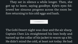
I believe that: blank line # blank line is the standard for scene breaks in the manuscript.
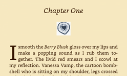
Then once someone (which could be the author) layout the interior design of the book, they will decide on a format of scene breaks that fits with the rest of the interior layout. It could simply be blank lines or even small symbols (heart or daggers ) instead of #. Whatever fits the interior design, which again should fit the mood of the novel.
Then once someone (which could be the author) layout the interior design of the book, they will decide on a format of scene breaks that fits with the rest of the interior layout. It could simply be blank lines or even small symbols (heart or daggers
C
ChantalS
Guest
Reedsy has a lot of free resources and classes. I don’t think they offer software, so they? That’s not their jam. Its worth the look over at their website.
I have seen it both ways: just a double space between paragraphs, and *** or similar in publised books from the major publishers.Question on formatting your MS: how do you indicate a change of time or scene within a chapter? Suggestions I've read range from simply double spacing between paragraphs, to using a symbol like #, * or ***. Searched the Craft Chat on formatting but couldn't find this specific example. Looking for best practice here!
I have a habit whenever such questions arise (whatever the subject and no matter how goofy) of Googling the question, I always get answers--sometimes pretty far off or far-out--or routes to answers. This one generates a whole bunch of opinions and the need to maybe fish out some concensus, or, just do what feels right to you. Of course, if you go with a traditional publisher, I trust they'll decide the formatting and you'll want to go with that.
I think that is the ultimate solution. My real problem is how to signify it in my drafts. Mostly how to keep track of the change in may head. I think I will start using the first word bold so that when I go back I can remember to put in asterisks.I have a habit whenever such questions arise (whatever the subject and no matter how goofy) of Googling the question, I always get answers--sometimes pretty far off or far-out--or routes to answers. This one generates a whole bunch of opinions and the need to maybe fish out some concensus, or, just do what feels right to you. Of course, if you go with a traditional publisher, I trust they'll decide the formatting and you'll want to go with that.
In a manuscript I'm submitting to someone else for publication, I used the standard # centred on the line. But in my self-published books, I use an appropriate glyph--I either draw my own, purchase one, or use an awesome bug font I bought years ago that has actual insects and spiders for one of the font variations.Question on formatting your MS: how do you indicate a change of time or scene within a chapter? Suggestions I've read range from simply double spacing between paragraphs, to using a symbol like #, * or ***. Searched the Craft Chat on formatting but couldn't find this specific example. Looking for best practice here!
- Thread starter
- #23
Agree on the #. I've decided to go with this for now as it seems to be the most widely accepted sign for a break in time or place. But I love the idea of creating your own graphics for self-pub! If I end up going this route, will definitely do this. Thanks!In a manuscript I'm submitting to someone else for publication, I used the standard # centred on the line. But in my self-published books, I use an appropriate glyph--I either draw my own, purchase one, or use an awesome bug font I bought years ago that has actual insects and spiders for one of the font variations.
C
ChantalS
Guest
I just read in a Facebook group - slightly different as it was about custom fonts for paragraphs, but I suppose works in light of Robinne’s comment - that an author had problems with these not loading on kindle.
Peyton Stafford
Full Member
For those not Scrivener-phobic, Scrivener does all that automatically (if you don't wreck the export settings).I recommend the free editor on reedsy.com. It is designed for writing books, so it knows about chapters and other features, like inserting scene breaks (!). The onscreen format is quite book-like and there are a couple of pdf export options and a word "backup" export.
You have to turn them into jpgs first--that's the trick. For a glyph, that works fine. Wouldn't do so well for a paragraph though.I just read in a Facebook group - slightly different as it was about custom fonts for paragraphs, but I suppose works in light of Robinne’s comment - that an author had problems with these not loading on kindle.
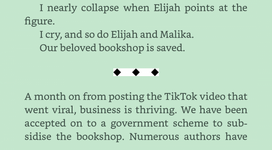
I just use the three asterisks (called a dinkus, oddly enough), of * * * . Problem solved. No unusual formatting to deal with, and very commonly used.
Using a gif would solve that problem (except with the black background, on which a black gif would disappear completely).Trouble with glyphs is that they have a default white background. Switch to a different Kindle page color, and they look wrong.
View attachment 14998View attachment 15003View attachment 15001
Sorry, I meant a png, not a gif...though a gif would work too. The key is to have a transparent background.Using a gif would solve that problem (except with the black background, on which a black gif would disappear completely).
- Status
- Not open for further replies.
Café Life Tag Cloud
2025
agent
author
authors
blog
book
books
cafe
challenge
christmas
competition
conferences
contest
creativity
december
editing
fantasy
fiction
friday
help
inspiration
life
literary
literature
litopia
love
motivation
music
new
news
novel
november
philosophy
poetry
prize
publishing
reading
self-publishing
sentence
shakespeare
short
short story
stories
story
time
world
write
writer
writers
writing
Similar threads
- Replies
- 10
- Views
- 757
Thought for the Day
People change and forget to .....
- Replies
- 1
- Views
- 560
Thought for the Day
Giving a reader a sex scene that is only half right is like ...
- Replies
- 3
- Views
- 788


