Questions for a Book Designer

Submissions Surgery This Saturday!

Submission Surgery Materials

Status
Not open for further replies.

AgentPete

Capo Famiglia
Guardian
Full Member
May 19, 2014
London UK
The next Michelle LIVE will happen on Monday 26th November at 6pm UK. We’re doing something a bit different this time, and bringing on a special guest who is an expert book designer – she designed Michelle’s forthcoming WAKENHYRST (below) and many others. If you have any questions you’d like to ask on this interesting subject, please pop ‘em in this thread and I’ll see they get addressed.
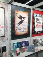
IMG_2504.jpg
 
In general, does a designer have the time, necessity or inclination (luxury?) to read the book they're designing for?

What excites you most about designing books covers?

What makes you sit back at the end of a job and say, "Yes, I've nailed that one"?

What is the biggest factor that drives trends in book cover design?
 
Where do we go to find book cover designers? Is there a list somewhere? I know Writers' & Artists' Yearbook do illustrators but not sure if they do book cover designers. Thanks.
 
Oh, I'm really interested in this. I would like to know, as @Rich. asked above, does the designer read the book before designing or is it simply from a brief?

I'd love to see/hear about the process (Maybe see some sample/ideas boards of the design process?)

How involved is the author in the process?
 
What is the process of designing a cover? What do they start with? e.g. do they look at the length of the title and work out how they will place it, or does it begin with the illustration?
 
That sounds really interesting.

My question would be: What do you think are the essential elements of a good book cover?
 
Thank you, everyone, all duly processed. If we don't have time to cover each one I'll ask Jessie to stay begind and record a few minutes extra that we can include in Pop-Ups...
 
Just a reminder that this will be going out live next Monday, 26th, at 6pm UK.

If you haven't asked a question above, but would like to chat live to a top-rate book designer, do join us LIVE on Facebook, Twitter, Instagram or YouTube and your questions /comments will be relayed in realtime. Full details here:

https://www.michellepaver.com/chat/
 
An interesting peek behind the curtain! I had no idea publishers go through so many cover options before settling on one. In marketing, we normally only provide 2-3 options for creative to clients (but often brainstorm more). But now I think about it, it makes sense. If it's in print, it's out there for years. Marketing creative has a short shelf-life in comparison and if it doesn't perform we can modify it next time around (or if it's digital, simply swap it out). Publishers don't have that luxury.
 
That was fantastic, I loved the conceptual process of the cover design and how the final one was decided upon. HoZ has particularly beautiful, timeless covers, I'm a sucker for eye-catching visuals :) Great Q&A.
 
An interesting peek behind the curtain! I had no idea publishers go through so many cover options before settling on one. In marketing, we normally only provide 2-3 options for creative to clients (but often brainstorm more). But now I think about it, it makes sense. If it's in print, it's out there for years. Marketing creative has a short shelf-life in comparison and if it doesn't perform we can modify it next time around (or if it's digital, simply swap it out). Publishers don't have that luxury.
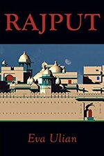
Yes, I found it interesting too. If you know about a book, fine- you buy it. But I'm sure there are many people who, like me, just look around, it is then I believe, that it is the cover that actually sells the book. So if the cover doesn't attract my eye, it doesn't get picked-up. And this is it, what does attract my eye? Very often it depends on what I'm looking for. If I'm looking for fun, then anything lighthearted or cartoonish will make me pick it up. If I want romance, well I'd probably look for a heart, or something and so on... What would put me off is something confusing, fuzzy. Prominent lettering would make me look and so would a bold, unusual image... nothing, bland or wishy-washy. But that's just me, my taste. That's why when I was commissioned to write a history of Rajasthan since I worked for an architect who restored a Royal Palace there, and I also had to design the cover I chose a majestic drawing from the architect to show what it was about and as the title "RAJPUT" (Son of a King) actually summarised who it was about, I placed it at the top of the book in big red letters, then as I was a "no-one" placed my name at the bottom of the book, in the same colour so there would be a balance and not a contrast but in much smaller dimensions. That's something else to bear in mind. Is the author more important than the title or vice-versa? They cannot be the same size- one must predominate, if you don't want to cause a kind of blur in people's eye- and the same goes for the imagery. But as I said, that's just what I think.41LLr8gkOxL._SY346_.jpg
 
Status
Not open for further replies.

Submissions Surgery This Saturday!

Submission Surgery Materials

Back
Top