Paul Whybrow
Full Member
I've previously ranted about cover art on the Colony, but I liked a cover design that just popped up on my Facebook feed from group Retromaniacs. Granted, it's from 1958, for a story in a magazine, and I recall a time when paperbacks had similar lurid covers...especially science-fiction, fantasy and crime stories.

The artist: Ed Emshwiller - Wikipedia
The writer: Rog Phillips - Wikipedia
The magazine: If (magazine) - Wikipedia
Rat In The Skull was nominated for the Hugo Award. As If magazine editors said: "Some people will be shocked by this story. Others will be deeply moved. Everyone who reads it will be talking about it. Read the first four pages: then put it down if you can."
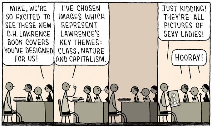
I don't know how much a book's cover influences a reader's decision to read it, but for me, it's a bonus if the artwork is pleasant to look at. If the author is unknown to me, then an ugly, inappropriate or hackneyed cover puts me off.
Book cover design follows trends, which makes it look like artists are copying one another. I borrowed two novels from the library this week, whose covers make me think that someone tested their marker pen on them.


8 ingenious book cover design trends for 2018 - 99designs
Of all the books I've read in 2018, I most liked the cover of All That Remains: A Life In Death by Sue Black, in which the middle of a skeleton sprawls across the front face of the dust jacket, its shoulders on the spine and the skull on the back face, while the lower legs and feet bend onto the front flap.
Do you have any favourite book cover art?
Or designs that you loathe?


The artist: Ed Emshwiller - Wikipedia
The writer: Rog Phillips - Wikipedia
The magazine: If (magazine) - Wikipedia
Rat In The Skull was nominated for the Hugo Award. As If magazine editors said: "Some people will be shocked by this story. Others will be deeply moved. Everyone who reads it will be talking about it. Read the first four pages: then put it down if you can."
I don't know how much a book's cover influences a reader's decision to read it, but for me, it's a bonus if the artwork is pleasant to look at. If the author is unknown to me, then an ugly, inappropriate or hackneyed cover puts me off.
Book cover design follows trends, which makes it look like artists are copying one another. I borrowed two novels from the library this week, whose covers make me think that someone tested their marker pen on them.


8 ingenious book cover design trends for 2018 - 99designs
Of all the books I've read in 2018, I most liked the cover of All That Remains: A Life In Death by Sue Black, in which the middle of a skeleton sprawls across the front face of the dust jacket, its shoulders on the spine and the skull on the back face, while the lower legs and feet bend onto the front flap.
Do you have any favourite book cover art?
Or designs that you loathe?


