Paul Whybrow
Full Member
I’ve praised the Book Designer website several times on the Colony. Run by Joel Friedlander, it’s not just about the aesthetics of how a book looks, but tackles a range of subjects to do with publishing. His weekly aggregator of the best stories from other sites is worth subscribing to.
In May, I sent off my book cover design for the first story in my Cornish Detective series, Who Kills A Nudist? to The Book Designer to be judged in their monthly eBook cover design award. Some of the covers have been done by the authors, others are the work of professional artists.
I’ve designed all the covers for the 52 eBooks that I’ve uploaded to Amazon KDP. I couldn’t afford to pay an artist-designer, and, as I have a background in art and photography, I have a fair idea of what to do.
I thought I hadn’t been chosen, as my cover didn’t appear last month, but he must have had a backlog, as it was there today. The comments were so-so but I value them.
The Book Designer - Practical advice to help build better books
PAUL WHYBROW submitted Who Kills A Nudist? designed by PAUL WHYBROW. “The seagull appears in the story as a symbol of the fragility of nature, as well as the hostility of the wild world. The titular nudist victim is discovered by a witness in Chapter who sees a gull land and hop across to peck at his eyes.”
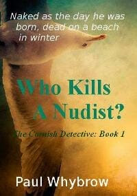
TP: The colors of the cover are very nice, but the choice of fonts isn’t too good. There are too many different fonts that were used and they don’t work too well together. It would also be good to use this image from a different angle maybe.
I should write to Joel Friedlander to ask about the problem of designing an image that looks great full-sized and tile-sized – which is how readers first see the book cover on a sales site. I always include an image, a shape that can be discerned in tile size. I agree with the comment about fonts, though funnily enough, I think that I used only two different fonts and that was based on advice from The Book Designer site! This is a very exacting area of book promotion and, even though I’ve been reading their newsletters for four years, I still haven’t worked out which fonts are considered best for each genre.
Why not have a go at submitting to their monthly award?

J. Pepper Bryars
In May, I sent off my book cover design for the first story in my Cornish Detective series, Who Kills A Nudist? to The Book Designer to be judged in their monthly eBook cover design award. Some of the covers have been done by the authors, others are the work of professional artists.
I’ve designed all the covers for the 52 eBooks that I’ve uploaded to Amazon KDP. I couldn’t afford to pay an artist-designer, and, as I have a background in art and photography, I have a fair idea of what to do.
I thought I hadn’t been chosen, as my cover didn’t appear last month, but he must have had a backlog, as it was there today. The comments were so-so but I value them.
The Book Designer - Practical advice to help build better books
PAUL WHYBROW submitted Who Kills A Nudist? designed by PAUL WHYBROW. “The seagull appears in the story as a symbol of the fragility of nature, as well as the hostility of the wild world. The titular nudist victim is discovered by a witness in Chapter who sees a gull land and hop across to peck at his eyes.”
TP: The colors of the cover are very nice, but the choice of fonts isn’t too good. There are too many different fonts that were used and they don’t work too well together. It would also be good to use this image from a different angle maybe.
I should write to Joel Friedlander to ask about the problem of designing an image that looks great full-sized and tile-sized – which is how readers first see the book cover on a sales site. I always include an image, a shape that can be discerned in tile size. I agree with the comment about fonts, though funnily enough, I think that I used only two different fonts and that was based on advice from The Book Designer site! This is a very exacting area of book promotion and, even though I’ve been reading their newsletters for four years, I still haven’t worked out which fonts are considered best for each genre.
Why not have a go at submitting to their monthly award?
J. Pepper Bryars