Paul Whybrow
Full Member
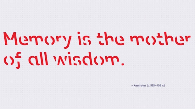
This article about a new font called Sans Forgetica designed to aid recall of what's read sounds unfeasible:
Font of all knowledge? Researchers develop typeface they say can boost memory
I wonder how readers troubled by dyslexia cope with it.
We discussed font selection last year, in a thread started by @Katie-Ellen Hazeldine, but it's a factor that remains important when querying.
Literary agents usually specify which font they prefer for submissions. They favour 12-point Times, Times New Roman, Courier, or Courier New. When writing screenplays, Courier appears to rule.
I chose Times New Roman as being the easiest on the eye. It's not without its problems, though, as I found when I first typed the name of a sculptor who appears as a witness in my latest Cornish Detective novel. She's a no-nonsense, six foot tall, heavily-muscled biker of 60, with scarlet hair, colourful tattoos and scarred hands from four decades of pounding chips from granite and marble. I wanted to give her a tough-sounding name, so chose Bekka Burn...which works, but the 'r' and 'n' run together, making it look like she's called Bekka Bum!")
Another aspect of Times New Roman that I dislike, is how when using italics, some letters flop onto the next letter, making it look like you've mucked up the spacing.
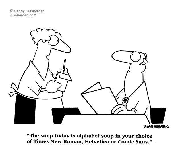
Typography causes a lot of debate. Comic Sans is the main bone of contention, even though it's commonly used with young readers:
What's so wrong with Comic Sans?
But even Times New Roman gets criticised for overuse:
Times New Roman Is Bad for Your Career
I've made most of my 500 submissions in Times New Roman. A few agents specified Arial, and oneweirdo absolutely insisted on Garamond...they stated that they'd reject any manuscripts typed in another font.
Strangely, given the popularity of Times New Roman, the three novels I'm reading at the moment are typeset in Sabon, Minion, and Plantin. I guess that a house style has something to do with the choice of typeface. Many, many publishers no longer specify in what font their books are printed as if it's irrelevant. Dumbing down marches on.
If self-publishing, you can choose whatever font you like, but I'd heed the advice of design experts, such as found on the brilliant blog The Book Designer run by Joel Friedlander, which is well-worth subscribing to:
Understanding Book Fonts & Typography for Self-Publishers
It's worth remembering when a new novelty font appears, that creative designers are chasing money:
https://www.quora.com/How-much-money-do-you-make-selling-your-own-fonts
Do you write in a different font to what you submit your query in?
When making preparatory notes for my WIP, I deliberately use different fonts and colours to make important information stand out.
What do you make of the new Sans Forgetica font?
If you designed your own font, what would you call it?
I chose Parsi (from a Persian ancestor) and Pithy (Pithy Words is the name of my company), but they both already exist! So, I went for the Devilheart font—from my original pen name Augustus Devilheart. Hell knows what it would like....
Font of all knowledge? Researchers develop typeface they say can boost memory
I wonder how readers troubled by dyslexia cope with it.
We discussed font selection last year, in a thread started by @Katie-Ellen Hazeldine, but it's a factor that remains important when querying.
Literary agents usually specify which font they prefer for submissions. They favour 12-point Times, Times New Roman, Courier, or Courier New. When writing screenplays, Courier appears to rule.
I chose Times New Roman as being the easiest on the eye. It's not without its problems, though, as I found when I first typed the name of a sculptor who appears as a witness in my latest Cornish Detective novel. She's a no-nonsense, six foot tall, heavily-muscled biker of 60, with scarlet hair, colourful tattoos and scarred hands from four decades of pounding chips from granite and marble. I wanted to give her a tough-sounding name, so chose Bekka Burn...which works, but the 'r' and 'n' run together, making it look like she's called Bekka Bum!
Another aspect of Times New Roman that I dislike, is how when using italics, some letters flop onto the next letter, making it look like you've mucked up the spacing.
Typography causes a lot of debate. Comic Sans is the main bone of contention, even though it's commonly used with young readers:
What's so wrong with Comic Sans?
But even Times New Roman gets criticised for overuse:
Times New Roman Is Bad for Your Career
I've made most of my 500 submissions in Times New Roman. A few agents specified Arial, and one
Strangely, given the popularity of Times New Roman, the three novels I'm reading at the moment are typeset in Sabon, Minion, and Plantin. I guess that a house style has something to do with the choice of typeface. Many, many publishers no longer specify in what font their books are printed as if it's irrelevant. Dumbing down marches on.
If self-publishing, you can choose whatever font you like, but I'd heed the advice of design experts, such as found on the brilliant blog The Book Designer run by Joel Friedlander, which is well-worth subscribing to:
Understanding Book Fonts & Typography for Self-Publishers
It's worth remembering when a new novelty font appears, that creative designers are chasing money:
https://www.quora.com/How-much-money-do-you-make-selling-your-own-fonts
Do you write in a different font to what you submit your query in?
When making preparatory notes for my WIP, I deliberately use different fonts and colours to make important information stand out.
What do you make of the new Sans Forgetica font?
If you designed your own font, what would you call it?
I chose Parsi (from a Persian ancestor) and Pithy (Pithy Words is the name of my company), but they both already exist! So, I went for the Devilheart font—from my original pen name Augustus Devilheart. Hell knows what it would like....