Navigation
Install the app
How to install the app on iOS
Follow along with the video below to see how to install our site as a web app on your home screen.
Note: This feature may not be available in some browsers.
More options
Style variation
-
Café Life is the Colony's main hangout, watering hole and meeting point.
This is a place where you'll meet and make writing friends, and indulge in stratospherically-elevated wit or barometrically low humour.
Some Colonists pop in religiously every day before or after work. Others we see here less regularly, but all are equally welcome. Two important grounds rules…
- Don't give offence
- Don't take offence
We now allow political discussion, but strongly suggest it takes place in the Steam Room, which is a private sub-forum within Café Life. It’s only accessible to Full Members.
You can dismiss this notice by clicking the "x" box
You are using an out of date browser. It may not display this or other websites correctly.
You should upgrade or use an alternative browser.
You should upgrade or use an alternative browser.
TED Talk "The hilarious art of book design"
- Thread starter Rich.
- Start date
- Status
- Not open for further replies.
Paul Whybrow
Full Member
Well worth watching. I like what he says about respecting the reader. Also, how it's more stimulating for the book designer and the reader to appreciate a printed book, rather than the cover of an e-book, which feels more like coming up with an image for a catalogue.
Nice! I wonder how many designers actually read the book, judging by some of the covers they come up with.
Paul Whybrow
Full Member
Writing guru Nathan Bransford just posted about how there's a movement to allow authors to have more control over their book covers.
Should authors have more control over their covers? - Nathan Bransford | Writing, Book Editing, Publishing
Like Bransford, I can't decide if this is a good thing or not. I agree that a commercial artist should know what designs and colours and typography work best in different markets, but I've seen some book covers that barely represented what happens in the story. On one, the protagonist looked nothing like he was described, the vehicles shown were wrong, as was the terrain. Then again, I've seen covers that were accurate and beautiful to look at—this happens in the Fantasy Genre a lot—but, the cover was superior to the story, almost a case of false advertising. Like every ready meal!
Nevertheless, a book cover represents the culmination of thousands of hours of hard work by the writer. It's the first thing that readers look at in a book shop, library or online. So, an author should at the very least, be content with the design. Or designs, for there will be many different covers for foreign markets.
I'm artistic by nature and training and grew up manipulating photographic images, as my father was a professional photographer. Going the self-publishing route and being poor, unable to hire artists, I've designed all my book covers. There are all sorts of tips, tricks and conventions to use. I previously commented on Pink & Glittery Covers for Chick-Lit, but did you know that different writing genres favour particular colours? See this article for a beginner's guide:
Best Colors for Book Covers - COVER DESIGN STUDIO
I'm currently reading a crime novel and a guide to forensics which both have black covers, and a self-help book which is white.
If designing a cover for an eBook, it's wise to consider how small it will be on an Amazon listing viewed on a smartphone. Easily recognisable images and large plain lettering make a book stand out, as here:

What looks attractive and sophisticated on a hardback held in your hand, with a subtly painted design overlaid with a cursive font for the title and author, might look like a squashed fly viewed in tile size!
I'm making a return to self-publishing for my Cornish Detective series, so have got jiggy with my IrfanView skills. As part of creating an author platform, I've taken into account what my brand looks like, which means I use the same two fonts on my covers, saying which number this investigation is in the series and finding an image that hints at what's in the story.
Just tracking down appropriate copyright-free images takes hours sometimes, and using them has all sorts of legal ramifications, which I'll tackle in an upcoming thread.
I mentioned colophons in an old thread, and I've used them in my crime novels to delineate section breaks. I use one of these symbols from a copyright-free Celtic knot font, which looks better than typing * * * for each section break:

Trying to add to the Cornish flavour of the novels, I designed banners to go across the top of significant pages on the website and on my Facebook business page:

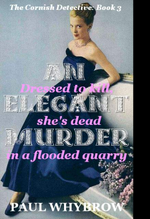
One of the advantages of eBooks is that it's easy to change details, including cover designs, so I'll experiment to see what difference a new cover makes. Here's the latest, which is for a story that begins with the body of an elderly woman found drowned in a quarry on the moor, wearing a blue 1950s ball gown and long leather gloves, which once belonged to her mother, a society belle who gave it all up to become a farmer's wife.
I may change the spacing and colours of the fonts, but for the moment it looks like this (without the black border):

Should authors have more control over their covers? - Nathan Bransford | Writing, Book Editing, Publishing
Like Bransford, I can't decide if this is a good thing or not. I agree that a commercial artist should know what designs and colours and typography work best in different markets, but I've seen some book covers that barely represented what happens in the story. On one, the protagonist looked nothing like he was described, the vehicles shown were wrong, as was the terrain. Then again, I've seen covers that were accurate and beautiful to look at—this happens in the Fantasy Genre a lot—but, the cover was superior to the story, almost a case of false advertising. Like every ready meal!
Nevertheless, a book cover represents the culmination of thousands of hours of hard work by the writer. It's the first thing that readers look at in a book shop, library or online. So, an author should at the very least, be content with the design. Or designs, for there will be many different covers for foreign markets.
I'm artistic by nature and training and grew up manipulating photographic images, as my father was a professional photographer. Going the self-publishing route and being poor, unable to hire artists, I've designed all my book covers. There are all sorts of tips, tricks and conventions to use. I previously commented on Pink & Glittery Covers for Chick-Lit, but did you know that different writing genres favour particular colours? See this article for a beginner's guide:
Best Colors for Book Covers - COVER DESIGN STUDIO
I'm currently reading a crime novel and a guide to forensics which both have black covers, and a self-help book which is white.
If designing a cover for an eBook, it's wise to consider how small it will be on an Amazon listing viewed on a smartphone. Easily recognisable images and large plain lettering make a book stand out, as here:

What looks attractive and sophisticated on a hardback held in your hand, with a subtly painted design overlaid with a cursive font for the title and author, might look like a squashed fly viewed in tile size!
I'm making a return to self-publishing for my Cornish Detective series, so have got jiggy with my IrfanView skills. As part of creating an author platform, I've taken into account what my brand looks like, which means I use the same two fonts on my covers, saying which number this investigation is in the series and finding an image that hints at what's in the story.
Just tracking down appropriate copyright-free images takes hours sometimes, and using them has all sorts of legal ramifications, which I'll tackle in an upcoming thread.
I mentioned colophons in an old thread, and I've used them in my crime novels to delineate section breaks. I use one of these symbols from a copyright-free Celtic knot font, which looks better than typing * * * for each section break:

Trying to add to the Cornish flavour of the novels, I designed banners to go across the top of significant pages on the website and on my Facebook business page:

One of the advantages of eBooks is that it's easy to change details, including cover designs, so I'll experiment to see what difference a new cover makes. Here's the latest, which is for a story that begins with the body of an elderly woman found drowned in a quarry on the moor, wearing a blue 1950s ball gown and long leather gloves, which once belonged to her mother, a society belle who gave it all up to become a farmer's wife.
I may change the spacing and colours of the fonts, but for the moment it looks like this (without the black border):

I love the banner- very suggestive. I like the book cover too but the writing is not very clear especially the pink part, and may not get read immediately. Maybe you could put the writing on a banner background so it will stand out.
I think ditch the pink bits, love the title "An elegant murder", goes so well with the picture, and blue and silver go so well together, but can you make it darker? The pink font is distracting. That's just my $2 cents.
J
Jiannina Camillo
Guest
Hilarious, but very much to the point. Coupled with agent Pete's advice about the importance of a title, it all makes a lot of sense.
- Status
- Not open for further replies.
Café Life Tag Cloud
2025
agent
author
authors
blog
book
books
cafe
challenge
christmas
competition
conferences
contest
creativity
december
editing
fantasy
fiction
inspiration
life
literary
literature
litopia
love
motivation
music
new
news
novel
november
philosophy
poetry
prize
publishing
reading
self-publishing
sentence
shakespeare
short
short story
stories
story
storytelling
time
words
world
write
writer
writers
writing
Similar threads
- Replies
- 0
- Views
- 418
- Replies
- 1
- Views
- 454
Thought for the Day
Some people talk about other people’s failures with so much ...
- Replies
- 0
- Views
- 619
- Replies
- 0
- Views
- 493
Thought for the Day
Writers often like to talk about how...
- Replies
- 0
- Views
- 413
Latest Articles By Litopians
-
When We Shot the Last Rhino
. A fabled hunter from Milan or Mombasa or somewhere raised his arms high and screamed in bloody t ...
-
On the shoulders of giants.
I’ve got to stop hanging out on X. The writing community has, yet again, been rent apart by a schi ...
-
Lit Mags for Beginners – Part Two
Last time we talked about finding publications to send your work to. Now you’ve imagined your stor ...
-
A Word from Nigel
This is Nigel. Nigel is a horse. More specifically, Nigel is a feral stallion responsible for a herd ...
-
Lit Mags for Beginners – Part One
It’s less than a year since I started writing short stories, having only worked on novel-length fi ...
-
Days Like Those: Jacob, James and the BSG
February 2018… Mrs Treaclechops and I took grandchildren Jacob (aged four) and James (aged three) ...
-
Matt-y numty had a great fall
I had an appointment in Berlin’s Mitte recently. Since then, I’ve been thinking a lot. Now, the ...
What Goes Around
Comes Around!
