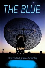
So...I'm no artist - and nowhere near finishing my novel. Yet still I've made a cover. I found a public-domain photo and modified it to work for my novel. The license for this photo permits public and commercial use as long as it's properly attributed. Hopefully, this covers it...
Cover image courtesy of the Commonwealth Science Industrial Research Organization (CSIRO), titled “CSIRO’S PARKES RADIO TELESCOPE WITH MOON IN THE BACKGROUND” under the Creative Commons license.
The original photo was taken in 1969 at the time of the first manned moon landing. The moon was not blasted away from Earth orbit on 13 September 1999, but merely removed by digital means. Additional changes to the image have also been made for the purposes of this novel.
Anyhoo...what are your thoughts on appropriating a public-domain photo for a novel? Is it amateurish? Would my attempt interest you enough to have a look inside?
Thanks !
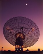
Attachments
Last edited:
")
")