Paul Whybrow
Full Member
There are various things about the book world that I don't understand:
1) Are literary agents editors? The terms are often used interchangeably. I know that agents do editing, but is this at small agencies who don't employ a dedicated editor? What do editorial assistants do?
2) As debut writers, we're advised to stick to established word counts. Crime novels at 80,000-90,000 words are typically 300-350 pages long, depending on page and print size.
Yet, some first novels are immense! House of Leaves by Mark Z. Danielewski, is 709 pages long, some 200,000 words and is filled with second and third appendices, coloured words, and vertical footnotes. Jonathan Strange & Mr Norrell, by Susanna Clark, is 1,024 pages long with a word count of 317,440! Jonathan Frantzen's debut novel The Twenty-Seventh City came in at 544 pages and 168,640 words.
Were their debuts so wordy because they'd already ingratiated themselves in the publishing world through writing short stories, articles for literary journals and reviews? It appears to be part of the etiquette of a book being deemed 'literary' that it's at least 400 pages long.
3) Book covers that have designs that are nothing to do with the plot drive me nuts! Initially, I naively thought that the artist would have read the book, or at least been given an accurate synopsis of the plot, including key details such as the protagonist's appearance, make of vehicle and the location of the story. But, apparently, they don't get even that to work on, and instead the designs are targetted at eliciting an emotional response from the reader—forget accuracy!
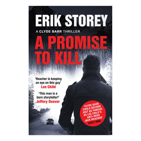
It's bad enough that designs are often cobbled together from several bought-in stock images, but some of them amount to flagrant false advertising—as bad as processed food packaging. One of the worst examples of the 250 novels I read this year, was A Promise to Kill, by Erik Storey, whose cover shows a man watching a 4×4 approaching along what looks like a dusty mountain trail. There weren't any such vehicles in the plot, which took place largely in the desert, and the protagonist wasn't dressed like the figure—which looks like it was lifted from a catalogue for raincoats!

But then, the cover is adorned with two endorsements by heavy hitters in the crime genre, Lee Child and Jeffery Deaver, who both appear to have a sideline in providing book blurb, so perhaps the design is irrelevant. While I'm being bitchy, the story was riddled with errors about guns and vehicles, so maybe the cover is appropriate after all.
These are three of my pet peeves.
What bothers you about the book world?
1) Are literary agents editors? The terms are often used interchangeably. I know that agents do editing, but is this at small agencies who don't employ a dedicated editor? What do editorial assistants do?
2) As debut writers, we're advised to stick to established word counts. Crime novels at 80,000-90,000 words are typically 300-350 pages long, depending on page and print size.
Yet, some first novels are immense! House of Leaves by Mark Z. Danielewski, is 709 pages long, some 200,000 words and is filled with second and third appendices, coloured words, and vertical footnotes. Jonathan Strange & Mr Norrell, by Susanna Clark, is 1,024 pages long with a word count of 317,440! Jonathan Frantzen's debut novel The Twenty-Seventh City came in at 544 pages and 168,640 words.
Were their debuts so wordy because they'd already ingratiated themselves in the publishing world through writing short stories, articles for literary journals and reviews? It appears to be part of the etiquette of a book being deemed 'literary' that it's at least 400 pages long.
3) Book covers that have designs that are nothing to do with the plot drive me nuts! Initially, I naively thought that the artist would have read the book, or at least been given an accurate synopsis of the plot, including key details such as the protagonist's appearance, make of vehicle and the location of the story. But, apparently, they don't get even that to work on, and instead the designs are targetted at eliciting an emotional response from the reader—forget accuracy!
It's bad enough that designs are often cobbled together from several bought-in stock images, but some of them amount to flagrant false advertising—as bad as processed food packaging. One of the worst examples of the 250 novels I read this year, was A Promise to Kill, by Erik Storey, whose cover shows a man watching a 4×4 approaching along what looks like a dusty mountain trail. There weren't any such vehicles in the plot, which took place largely in the desert, and the protagonist wasn't dressed like the figure—which looks like it was lifted from a catalogue for raincoats!

But then, the cover is adorned with two endorsements by heavy hitters in the crime genre, Lee Child and Jeffery Deaver, who both appear to have a sideline in providing book blurb, so perhaps the design is irrelevant. While I'm being bitchy,
These are three of my pet peeves.
What bothers you about the book world?
