Litopia

We’re delighted you’re here! You’re just a few clicks away from joining the ‘net’s oldest community for writers… and certainly the friendliest. Click the “Register” button to create a free account. See you in the Colony!

  • Clichés & Tropes! Can’t live with ‘em, can’t live without ‘em! Share your opinion in the latest Craft Chat, live now until Saturday

Writing goals for July.

What Literary Agents Should Tell You....

Status
Not open for further replies.

Katie-Ellen

Full Member
LV
2
 
Awards
1
According to William Shunn, - a well worn name round here - Courier (12 point) is THE font to use when submitting your MSS to editors (and agents?)


Your manuscript should look typed, not typeset. This is particularly important if you are composing your manuscript on a computer, where the temptation to use fancy fonts can be great. Use a Courier font; most every printer you can buy comes with Courier, so you have no excuse for not using it. Use a 12-point Courier, which prints out at a pitch of ten characters per inch. Don't use a 10- point Courier, which prints out at a pitch of twelve characters per inch. This is too small. (Point size refers to the height of the characters in a font; pitch refers to the width.)

Courier is a monospaced font, which means that every character is exactly as wide as every other. Never submit a manuscript that uses a proportional font, which is one in which an "i" takes up less space than an "m" does. It is far easier for an editor to detect spelling errors in a monospaced font than in a proportional font, and your primary goal should be to make things as easy for the editor as possible. With a monospaced font, there will also be fewer characters on each line, which makes your lines easier for the editor to scan.


Article Expounding Upon Which Fonts NOT To Use


Re Courier:

The Courier font is used on movie scripts, novel manuscripts and other forms of literary art. But in web design it has no place, unless you want your website to look like it’s fresh out of the typewriter.

For font alternatives, try Cousine.


Do you use Courier in your submissions, and do you, yourself, find it easier on your eye than Times New Roman, Verdana, Arial or Garamond?

What does our @Carol Rose think about this or @AgentPete ?
 

Carol Rose

Basic
LV
0
 
I use Times New Roman. Most publishers will specify a preferred font. For those that don't, it's long been the standard to use TNR or something similar. I honestly have no clue if that standard font has been replaced by now, because it's been a long time since I went looking at publishers' submissions guidelines. Evernight's site still says to use 12 pt Times New Roman, so despite the article's author not caring for it in web design (and that is what the article is about, no?), I think it's a safe default font for a manuscript if none is specified. I would definitely stay away from anything that doesn't look like the typing on this page. :) The idea is to make the manuscript easy to read, without the distraction of what amounts to fancy hand writing, so I don't think using a different font from TNR, as long as none is specified, will result in a rejection. Just make sure it's straight up and clean-looking. :)
 

Robinne Weiss

Full Member
LV
0
 
I use TNR unless Courier is specifically requested (I personally hate Courier). Some of the Sci-Fi magazines insist on making your MS look like you used a typewriter (Courier, underlines instead of italics, etc). I find this irritating (especially since some of them admit it's an anachronism, but they want it that way anyway). Mind you, if they ask for it that way, that's how I send it, but I grumble while I do so.
 

AgentPete

Capo Famiglia
Guardian
Full Member
LV
0
 
Yes, Courier is ugly.

The person cited above is confounding two things:

1) The submission process – solicited or unsol – where the entire object is to make as good an impression as possible. This means making the page look inviting to read!

2) Post-contract, your manuscipt will have to go through the editing process, and here I can see a case for using something like Courier, although these days, the key thing is the electronic file, not really the printout.
 

Katie-Ellen

Full Member
LV
2
 
Awards
1
Something didn't figure, and that explains it. The oft- cited William Shunn produced this protocol in 1998 or thereabouts. Thank you.
 

Patricia D

Basic
LV
0
 
I use TNR 12 point for submissions unless courier is requested - and sometimes it is, although IMO it looks clunky. But what do I know? I like Comic Sans, the font whose name is regularly trashed.
 

Paul Whybrow

Full Member
LV
0
 
I've made all of my submissions in Times New Roman, 12 point and double-spaced, apart from a few who asked for Arial. Just one specified Garamond, insisting that it would reject queries made in any other font! This quirkiness caused me a bit of a problem, as my LibreOffice writing software didn't have this font. I downloaded a pack with Garamond, which came with lots of Noto fonts in Chinese, Hindi, Balinese and Cherokee...I wonder if I'll ever use them in a story?
 

Carol Rose

Basic
LV
0
 
I like the look of Garamond and Verdana on websites, but don't use them in documents. I truly hate the look of Courier, new or otherwise. :)
 

Island Writer

Basic
LV
0
 
Verdana 10pt is my working font of choice - I find it easy on the eyes and clear of serif clutter. Once the words are ready, I'll format according to the font required.
 

AgentPete

Capo Famiglia
Guardian
Full Member
LV
0
 
Garamond is pretty classy indeed, but specifying that all subs should be exclusively in this font takes anality to its limits. "Thank you for your submission, Mr. Shakespeare. Unfortunately, you failed to comply with our strict font policy, so we have no option but to reject your work. We suggest you learn how to follow orders before submitting again. Have a lovely day!"
 

Paul Whybrow

Full Member
LV
0
 
It's always puzzled me how Comic Sans causes such intense dislike—surely, the prime test of a font is whether it's legible—and Comic Sans is. Strangely, there are other fonts such as Purisa that mimic handwriting which causes no fuss whatsoever.

A graphic designer friend advised me that Comic Sans offends because it's unmodulated—that is, the curved strokes of a letter such as 'S' don't vary in width. Also, Comic Sans has poor letter fit, meaning that some letters show odd spacing between them...the adjustment of such gaps is called 'kerning'. It's something I've noticed with some fonts, where when using italics one letter leans over so far as to touch the top of the next letter.

With the popularity of the emoji, it's surprising that no one has yet written a story in them. I don't think it's been done yet, though someone rendered famous album covers in emojis:

Guess These Classic Album Covers By Their Emoji Equivalent
 

Kim Donovan

Basic
LV
0
 
Interesting discussion! If you don't go through the traditional publishing route and end up independently publishing the book yourself, you will need to use fonts that embed (so the font looks as you want it to look even if the printing company doesn't have that font on their computer - if that makes sense!). I use Garamond because it embeds well. Fancy fonts often don't.
 

Katie-Ellen

Full Member
LV
2
 
Awards
1
Garamond is pretty classy indeed, but specifying that all subs should be exclusively in this font takes anality to its limits. "Thank you for your submission, Mr. Shakespeare. Unfortunately, you failed to comply with our strict font policy, so we have no option but to reject your work. We suggest you learn how to follow orders before submitting again. Have a lovely day!"

Hehe. Dear Mr Bard, bending the roolz. You ain't the Bard yet, bugger off.
 

AgentPete

Capo Famiglia
Guardian
Full Member
LV
0
 
It's always puzzled me how Comic Sans causes such intense dislike—surely, the prime test of a font is whether it's legible—and Comic Sans is. Strangely, there are other fonts such as Purisa that mimic handwriting which causes no fuss whatsoever.

I think it's the usage rather than the font itself - people go crazy with Comic Sans, see attached. Reminds me of the good old Arnold Bocklin days of Letraset yore...
slide-5.png.jpg
 

Paul Whybrow

Full Member
LV
0
 
Letraset! That takes me back...rubbing off letters from sticky, floppy sheets and trying to get them to adhere to paper without the rub marks showing too much. Then, running out of certain letters and having to think of a different word to describe something...which, come to think of it, might have contributed to my vocabulary.

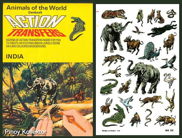
Also, there were Letraset action figure transfers, with which I adored school folders and pencil cases. Simpler times....

IndiaTransfer+copy.jpg
 
Status
Not open for further replies.

Writing goals for July.

What Literary Agents Should Tell You....

Top