Dilution or synergy?

A neophyte's beginning

Using Titles to Brand a Series

Status
Not open for further replies.

Brian Clegg

Basic
Aug 7, 2014
Swindon, UK
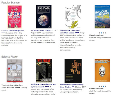
For over a decade I've run www.popularscience.co.uk - a review site for Popular Science books, which has built up to have around 30,000 unique visitors a month. I've also regular reviewed science fiction books on my (much less visited) blog. Recently I've decided to merge the SF into the popular science site (my reasoning below). Do you think it's a good move, or diluting the brand?

In part, this is because there was already some fiction on the Popular Science site. I'd featured a number of SF (and maths fiction) books which claimed to concentrate on serious science, using fiction as a way to get it across. So, the borderline was already a little fuzzy.

It's also the case that many popular science readers (and scientists) enjoy reading science fiction too - so why not put them together? The Popular Science site will still carry just as many reviews of popular science books - but with a little added SF to spice things up.

To kickstart it, I've duplicated all the SF reviews from my blog, and will be going live with the first all-new fiction review this week. If you have a moment please take a look at the revamped www.popularscience.co.uk and tell me what you think.

Popular_Science_-_Home_Page.jpg
 
I think it's a great idea. My comments re website is that perhaps the titles/differentiation of the two genres could be clearer- colour blocking maybe? Larger/bold subject titles?
Also, should clicking on subject titles take you to an interesting group page ie not just a list. Eg last month's/6 months releases (as people like new stuff) or most read/most popular.
Thanks - very helpful!
 
I like the combined review site and think it makes sense on many levels. My only question is about the equal weight you've the two genres. Because the popular science site has the much larger audience, perhaps you could - at least initially - assign the sci fi reviews a secondary role. I should add that this opinion is totally subjective and probably worth what you're paying for it, but you asked.
 
Thanks for your suggestions - I've tweaked the top of the page to reflect them as much as I can! Any more thoughts welcome - not necessarily on design, but also on the fit of science fiction with popular science.
 
I think that the combined site works well. I'm intrigued that some scientists enjoy reading science fiction—do they do so in a disparaging way, looking for the humour of the situation due to mistakes? In 2014, I wrote a novella set on Mars in the 22nd-century, which involved lots of research and diligent examination of the latest findings of the Mars Exploration Rover, some of which supported what my imagination had created, but also made some of my plotting immediately incorrect!
 
I think that the combined site works well. I'm intrigued that some scientists enjoy reading science fiction—do they do so in a disparaging way, looking for the humour of the situation due to mistakes? In 2014, I wrote a novella set on Mars in the 22nd-century, which involved lots of research and diligent examination of the latest findings of the Mars Exploration Rover, some of which supported what my imagination had created, but also made some of my plotting immediately incorrect!

Not at all (in a disparaging way) - many scientists (particularly physics/astronomy etc) got their early enthusiasm for science from science fiction and many continue to read/write it. You have to accept that story takes precedence over scientific accuracy - so most are happy to suspend disbelief on unlikely technology (time travel, warp drive etc.) and don't worry too much about inaccuracies. Pain tends to be caused more by downright idiocies, such as 'light years' being used as a measure of time (Star Wars, I think).
 
Looks great. Like the changes a lot.
Should the Science Fiction title be same size font as Popular Science? Also, is there another title that Popular Science genre could be given? Seems a little odd that the main website title and a sub-title are the same. Science Faction (?!)/ Factual Science?
Also would be lovely to have listed the buying info link to publishers website as well as/before Amazon- great to promote other buying options, but may be a heap of work to you to add. I'd certainly prefer people bought my books from the publisher, partly financially better for any author; partly as Amazon is very efficient/easy but a distinct take-over bid.
Just thinking....

I did have them the same size - I tried going smaller at Patricia's suggestion of not giving them equal weight. I take your point about the repetition from the title and will try options there.

Apart from the scale of the problem of putting in publisher links (there are around 1,000 reviews), the only funding the site gets apart from a little advertising is from Amazon affiliate payments. I don't know if any publishers do affiliate sales, but I suspect it would be quite messy to manage.
 
I really like the new titles, the science fact - science fiction dichotomy, but agree with AliG that putting the fonts in different sizes doesn't look good - even if it was done in response to my earlier comment. Plus the focus on the two genres still looks equal because the pictures dominate the visual.
 
I really like the new titles, the science fact - science fiction dichotomy, but agree with AliG that putting the fonts in different sizes doesn't look good - even if it was done in response to my earlier comment. Plus the focus on the two genres still looks equal because the pictures dominate the visual.
Fair point - I'll restore the font size. But I don't think the focus is equal any more as the science fiction is in a box within the main section. I'll try making the images a little smaller, but I don't want them to be tiny!
 
Fair point - I'll restore the font size. But I don't think the focus is equal any more as the science fiction is in a box within the main section. I'll try making the images a little smaller, but I don't want them to be tiny!
This is a good example of electronic communication not working as well as a conversation, and it's my fault. I still wonder if you want to give them equal weight, at least at the beginning, but didn't mean to be suggesting shrinking the images. The box you've used, perhaps an intervening sentence noting the addition of science fiction reviews, and/or an indentation for that section. Another thought - you could engage your readers by asking what they think about the addition. And now I will shut up.
 
This is a good example of electronic communication not working as well as a conversation, and it's my fault. I still wonder if you want to give them equal weight, at least at the beginning, but didn't mean to be suggesting shrinking the images. The box you've used, perhaps an intervening sentence noting the addition of science fiction reviews, and/or an indentation for that section. Another thought - you could engage your readers by asking what they think about the addition. And now I will shut up.

Don't worry - I will play around with all suggestions... but then feel free to change it to something I prefer! It's not a website that gets a lot of user comment - I have over 1200 people on the mailing list, for example, but when I ask for input, very rarely get any. I think they're more concerned with the content than the look. But I enjoy playing with it!
 
A source of reviews and information about science fiction books?! Lordy lord, is it my birthday?! Awesome stuff!

As to the site: no problem with the categories being brought together that I can see.
My own point of critical feedback (and this is not something you asked, but it jumped out at me) was that it took me a moment to realise that the asterisks after the title were the score. Could they be in a different font/colour or maybe inside brackets like [***]? A very minor niggle and one I can easily ignore.
Other than that, its all grand. Consider yourself bookmarked ;)

Thanks! Were you thinking of the title under the three latest reviews on the home page, or on each individual review? If the latter, I have no control over the font, and it would mean editing over 1,000, which would take a while! If the home page I have total control, so could do it - I could even use graphic stars instead - but then it wouldn't be consistent with the individual reviews... I take your point, but may not be able to do a lot!
 
Thanks! Were you thinking of the title under the three latest reviews on the home page, or on each individual review? If the latter, I have no control over the font, and it would mean editing over 1,000, which would take a while! If the home page I have total control, so could do it - I could even use graphic stars instead - but then it wouldn't be consistent with the individual reviews... I take your point, but may not be able to do a lot!

Yes, I meant the rating for each review. If that is too much work, then its really no big issue at all!
 
Status
Not open for further replies.

A neophyte's beginning

Using Titles to Brand a Series

Back
Top