- Thread starter
- #61
Navigation
Install the app
How to install the app on iOS
Follow along with the video below to see how to install our site as a web app on your home screen.
Note: This feature may not be available in some browsers.
More options
Style variation
-
Café Life is the Colony's main hangout, watering hole and meeting point.
This is a place where you'll meet and make writing friends, and indulge in stratospherically-elevated wit or barometrically low humour.
Some Colonists pop in religiously every day before or after work. Others we see here less regularly, but all are equally welcome. Two important grounds rules…
- Don't give offence
- Don't take offence
We now allow political discussion, but strongly suggest it takes place in the Steam Room, which is a private sub-forum within Café Life. It’s only accessible to Full Members.
You can dismiss this notice by clicking the "x" box
You are using an out of date browser. It may not display this or other websites correctly.
You should upgrade or use an alternative browser.
You should upgrade or use an alternative browser.
Been having a play...
- Thread starter Jake E
- Start date
- Status
- Not open for further replies.


- Thread starter
- #62


- Thread starter
- #63
Impossible to find it seemsMaybe replace the hand with a figure running away-comically. That shouldn't be too hard to find.

i say the fourth. not only is it somewhat of a "silly" font, but the font fits the rest of the cover and isn't displeasing, from a graphic design perspective. the fifth cover is a second-place to that, but the other fonts are subpar.So, since I can't find the right image or afford a professional artist, I'm going to try and get the humour across using the font.
Any of these say 'humour' to you?
View attachment 15467View attachment 15468View attachment 15470View attachment 15471View attachment 15472
also, i still do like the blue-and-yellow design scheme, but please please please do NOT use noticeable a stock image on the cover. it comes off as lazy and amateur, and *everyone* can tell that it's just a stock image. font-wise, the font is good, but doesn't give a "humorous" vibe
i'll reply to this thread with a design that i really think would be good. stay tuned
")
@Jake E okay, this is a design that i think is great for your book. the font and graphic say "humor," and the ornate border designs say "fantasy," plus the blue-and-yellow color scheme keeps it from seeming too young/MG. this is (in my humble opinion!) the ideal cover for your book. i hope this is okay

edit: sorry for the slightly bad quality, i edited this using kleki in about three seconds lol.
edit: sorry for the slightly bad quality, i edited this using kleki in about three seconds lol.
ChandlerJules
Sanity is the most profound moral option….R Adler
... With book covers.
I am awful at design and I think this latest experiment with book cover design has pretty much proved it lol.
Here are some of the 'masterpieces' I was able to create.
View attachment 15408View attachment 15409View attachment 15410
All feedback, ridicule/constructive criticism welcome. ha ha
ChandlerJules
Sanity is the most profound moral option….R Adler
@Jake E okay, this is a design that i think is great for your book. the font and graphic say "humor," and the ornate border designs say "fantasy," plus the blue-and-yellow color scheme keeps it from seeming too young/MG. this is (in my humble opinion!) the ideal cover for your book. i hope this is okay
View attachment 15477
- Thread starter
- #68
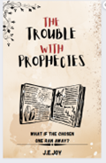
I showed my wife and she says she likes it. Though, i might lighten the colour the 'the' and 'with'.@Jake E okay, this is a design that i think is great for your book. the font and graphic say "humor," and the ornate border designs say "fantasy," plus the blue-and-yellow color scheme keeps it from seeming too young/MG. this is (in my humble opinion!) the ideal cover for your book. i hope this is okay
View attachment 15477
edit: sorry for the slightly bad quality, i edited this using kleki in about three seconds lol.
Amazing stuff Brooke. I never thought to mash the two designs together.
Genius move!
ChandlerJules
Sanity is the most profound moral option….R Adler
I favor this—shades of “Good Omens” with the prophecies (you could maybe try another font) but the blue and ornate corner seems in line with popular trends-it is the most eye-catching
- Thread starter
- #70
Is Good Omens a font?I favor this—shades of “Good Omens” with the prophecies (you could maybe try another font) but the blue and ornate corner seems in line with popular trends-it is the most eye-catching
a novel adapted into a tv show. (but the title font is interesting!)Is Good Omens a font?
i'm going to look around at fonts online for now, because, for reasons that simply can't be explained, i love them with all my heart
- Thread starter
- #72
Lol. I knew about the book. Was wondering if it was the name of a font too. Ha ha.a novel adapted into a tv show. (but the title font is interesting!)
i'm going to look around at fonts online for now, because, for reasons that simply can't be explained, i love them with all my heart
ChandlerJules
Sanity is the most profound moral option….R Adler
Oh no Neil gaiman and Terry Pratchett novel-just reminded me with the prophecies- I think that cover is strongIs Good Omens a font?
- Thread starter
- #74
Ah.Oh no Neil gaiman and Terry Pratchett novel-just reminded me with the prophecies- I think that cover is strong
I see lol.
@Jake E
as a trophy of your hard work on this book (and a token of my boredom in class), here's a, probably very innacurate, drawing of kelthi from your book, because every good writer deserves a fandom. looking forward to when your book is finally out; i'll be the first to buy
(kindly overlook the fact that any good drawing takes me upwards of two hours, and i had like, ten minutes for this one lol)
- Thread starter
- #76
I shall put it in pride of place on my website lol.@Jake E
as a trophy of your hard work on this book (and a token of my boredom in class), here's a, probably very innacurate, drawing of kelthi from your book, because every good writer deserves a fandom. looking forward to when your book is finally out; i'll be the first to buy
(kindly overlook the fact that any good drawing takes me upwards of two hours, and i had like, ten minutes for this one lol)
View attachment 15478
C
CageSage
Guest
I like Brooke's version - but put your name in a visible size!
This one!@Jake E okay, this is a design that i think is great for your book. the font and graphic say "humor," and the ornate border designs say "fantasy," plus the blue-and-yellow color scheme keeps it from seeming too young/MG. this is (in my humble opinion!) the ideal cover for your book. i hope this is okay
View attachment 15477
edit: sorry for the slightly bad quality, i edited this using kleki in about three seconds lol.
Flipping the colors works wonders with the cover. Good eye, Brooke 
I agree the author's name is too small. I think you should fix that, Jake. Some of us wear eyeglasses, you know
I still don't like the spoiler tagline. It gives away too much. Try something a little more ambiguous, like "The Chosen One has some explaining to do." I dunno.
I agree the author's name is too small. I think you should fix that, Jake. Some of us wear eyeglasses, you know
I still don't like the spoiler tagline. It gives away too much. Try something a little more ambiguous, like "The Chosen One has some explaining to do." I dunno.
- Thread starter
- #81
Another one i played about with wasFlipping the colors works wonders with the cover. Good eye, Brooke
I agree the author's name is too small. I think you should fix that, Jake. Some of us wear eyeglasses, you know
I still don't like the spoiler tagline. It gives away too much. Try something a little more ambiguous, like "The Chosen One has some explaining to do." I dunno.
'what if the chosen one was an asshole'
But, that spoils it too.
I'll have to think about it for a while, i think.
- Thread starter
- #82
Ok. Here we are.
Comments on the design for this series.
What do you think?
What changes - if any - do you think need to be made before I finally commit?


Thank you all of you for helping me get to this point. Without you, I'd have a very lackluster cover, and I appreciate all the effort you guys have put in.
J
Comments on the design for this series.
What do you think?
What changes - if any - do you think need to be made before I finally commit?
Thank you all of you for helping me get to this point. Without you, I'd have a very lackluster cover, and I appreciate all the effort you guys have put in.
J
- Thread starter
- #83
Just realised the font on the first one didn't match lol


i still like the first one! i know the tagline might be seen as too spoiler-y, but then again, you need the reader to know something about the book in the first place to convince them to give it a read.
i think you're trying to have a red undertone (with the red letters in the first design and the red lightning bolt in the third), but if you are, i'd recommend adding some more, because with just one red graphic it seems out of place. maybe change the border, the tagline, your name, or the book graphic to red (but not more than two of those ) to have the intended effect.
i think you're trying to have a red undertone (with the red letters in the first design and the red lightning bolt in the third), but if you are, i'd recommend adding some more, because with just one red graphic it seems out of place. maybe change the border, the tagline, your name, or the book graphic to red (but not more than two of those
) to have the intended effect.- Thread starter
- #85


I like them, but should it be "What if Destiny can be beaten"? (And I'm not sure you need the question marks in the tag lines.)
- Thread starter
- #88
Yes... But in this world, Destiny is a person/godI like them, but should it be "What if Destiny can be beaten"? (And I'm not sure you need the question marks in the tag lines.)
I still think the first is spoiley AF. Something like, "The Chosen One has some explaining to do" is accurate yet doesn't reveal too much.
The second novel doesn't suggest comedy at all (unless you know what "king" is). I don't know enough to suggest something. Unless...you make the tagline a callback to the previous novel. Something like, "The trouble with consequences."
I love the third title! Hopefully, enough people younger than me will get the joke. I don't like the tag, though. The question strongly suggests that Destiny will indeed be beaten. If destiny is a god, and she's pissed, how about "Destiny's riled."? If she's hated, maybe "Destiny's reviled."? Finally, she could be out of control - "Destiny's wild."
I'll leave now
- Thread starter
- #90
I'm a long way from hitting the 'publish' button, so I've got time to play with the tagline.I still think the first is spoiley AF. Something like, "The Chosen One has some explaining to do" is accurate yet doesn't reveal too much.
The second novel doesn't suggest comedy at all (unless you know what "king" is). I don't know enough to suggest something. Unless...you make the tagline a callback to the previous novel. Something like, "The trouble with consequences."
I love the third title! Hopefully, enough people younger than me will get the joke. I don't like the tag, though. The question strongly suggests that Destiny will indeed be beaten. If destiny is a god, and she's pissed, how about "Destiny's riled."? If she's hated, maybe "Destiny's reviled."? Finally, she could be out of control - "Destiny's wild."
I'll leave now
I'm still trying to sort out the middle of the book.
- Status
- Not open for further replies.
Café Life Tag Cloud
2025
agent
author
authors
blog
book
books
cafe
challenge
christmas
competition
conferences
contest
creativity
december
editing
fantasy
fiction
friday
help
inspiration
life
literary
literature
litopia
love
motivation
music
new
news
novel
november
philosophy
poetry
prize
publishing
reading
self-publishing
sentence
shakespeare
short
short story
stories
story
time
world
write
writer
writers
writing
Similar threads
- Replies
- 0
- Views
- 713
- Replies
- 1
- Views
- 673