Cover discussion - Split off from my blurb thread

The Mind of a Writer

Fanfare! Rejection from The New Yorker!

Status
Not open for further replies.
M

MichaelBlackbourn

Guest
I'm going to put new posts regarding my cover in here.

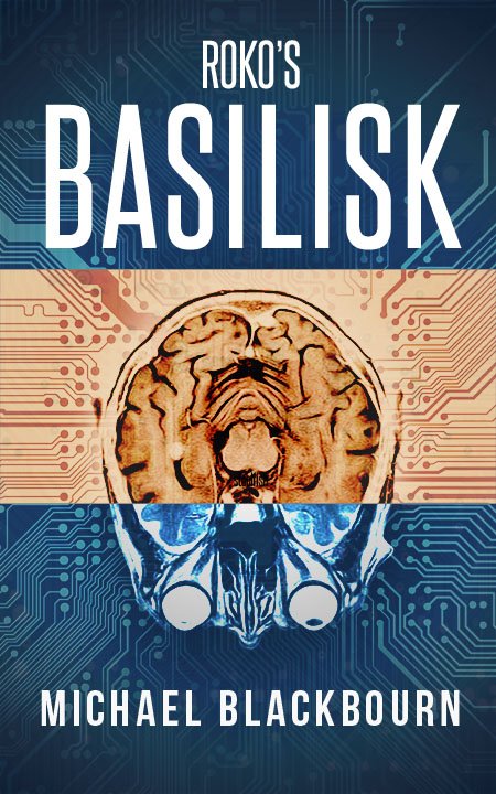
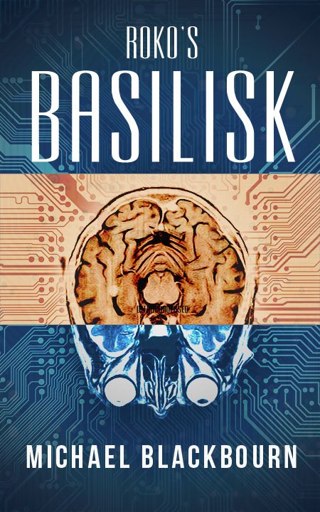
I was wondering if you wanted to share thoughts on fonts. Here are my leading three contenders:
CeXaODUUEAANWuf.jpg


CeXaOEBUUAAWlNj.jpg


CeXaOERUEAE4DAC.jpg
 
and how this scheme could be used for part 2... i would change the brain image.. but this is the kind of color variation thats possible:

CeXhp9nUEAAft3U.jpg
 
I rather like the third one, but I suspect the second one would stand out better from an advertising point of view.
 
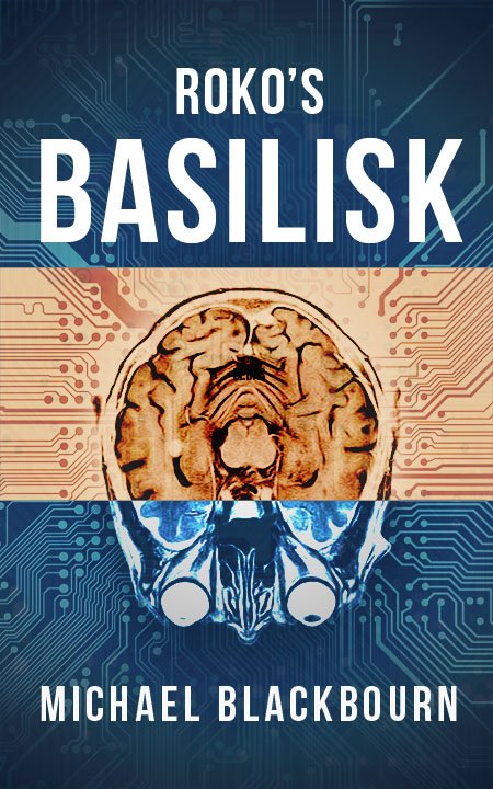
I went with the third one and tweaked it a little:

Ceo-libWQAAGUtm.jpg


It's live on Amazon but I'm not going to push it too hard until I get part 2 posted in a couple weeks.
 
That's a really great cover. I like the color scheme and font that you went with. I rather liked the font in the second version that you posted but this looks great too.

Thanks! Yeah I'm pretty happy with it. Has a bit of a creepy vibe.
 
Status
Not open for further replies.

The Mind of a Writer

Fanfare! Rejection from The New Yorker!

Back
Top