Navigation
Install the app
How to install the app on iOS
Follow along with the video below to see how to install our site as a web app on your home screen.
Note: This feature may not be available in some browsers.
More options
Style variation
-
Café Life is the Colony's main hangout, watering hole and meeting point.
This is a place where you'll meet and make writing friends, and indulge in stratospherically-elevated wit or barometrically low humour.
Some Colonists pop in religiously every day before or after work. Others we see here less regularly, but all are equally welcome. Two important grounds rules…
- Don't give offence
- Don't take offence
We now allow political discussion, but strongly suggest it takes place in the Steam Room, which is a private sub-forum within Café Life. It’s only accessible to Full Members.
You can dismiss this notice by clicking the "x" box
You are using an out of date browser. It may not display this or other websites correctly.
You should upgrade or use an alternative browser.
You should upgrade or use an alternative browser.
Self-Publishing Would you be happy if this was your book cover?
- Thread starter Pamela Jo
- Start date
It doesn't appeal to me but I suppose its unusual layout makes it stand out from the crowd.
- Thread starter
- #4
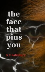
OOH. This is simple but eerie. What I learned doing layouts was NEVER make someone turn a book or page to read. To me this isn't similar at all. It's easily readable at first glance. Maybe if the eye was slightly lighter it would pop out at you a bit more. I didn't see it until I'd read all the title. But I think it captures the feeling of your book. Did you do it yourself?The text is confusing and it takes an effort to read it.
Funnily enough, it's similar to mine in terms of the layout, but I went with horizontal writing:
View attachment 16399
which is much easier to read.
- Thread starter
- #6
I come from a magazine cover background so I'm going to lean toward seeing something as you rush by a newsstand. I love the choice for a book cover. Well done.Yes, I did!
Happy that the eye is a little indistinct because it goes with the mystery within the story.....
Tazmania
Colony Member
I feel like it makes me put in too much work to find the info I want to know. I do like the choices of color and imagery though.
Maybe it's deliberate? It has been made into a blockbuster movie, so it obviously didn't hurt sales.
- Thread starter
- #9
I'm going to be the odd one out here. I think this cover is a lot cleverer than it may seem. It "works" for me. I wouldn't choose it for my book but it does something many other books don't.
The words "Openheimer" and "American Prometheus" are easy to spot/read/see. If that grabs me (were I interested in that kind of thing), I'd now have to "work" to read the rest of the cover because the rest is sideways. Doing that makes me "engage" with the book. I have to do something (turn the book, or my head, or my attention sideways) which means I'm now interacting with it and therefore give it more attention. In a shop, it'd be in my hands (and when we hold books we tend to flip them and read the back) and that is an important step in the selling / buying.
The words "Openheimer" and "American Prometheus" are easy to spot/read/see. If that grabs me (were I interested in that kind of thing), I'd now have to "work" to read the rest of the cover because the rest is sideways. Doing that makes me "engage" with the book. I have to do something (turn the book, or my head, or my attention sideways) which means I'm now interacting with it and therefore give it more attention. In a shop, it'd be in my hands (and when we hold books we tend to flip them and read the back) and that is an important step in the selling / buying.
Last edited:
- Thread starter
- #11
Ah! I'm sure you've hit on the rationale for going with this cover. And I think it shows this cover is targeting a specific audience. Those who've seen the film and now want to know more. Those who would never have picked up the book without the film. I would argue with the text being easy to read, but I bet the instructions are to place this book on a table where it can be read at all angles. As you say interacting with it.I'm going to be the odd one out here. I think this cover is a lot cleverer than it may seem. It "works" for me. I wouldn't choose it for my book but it does something many other books don't.
The words "Openheimer" and "American Prometheus" are easy to spot/read/see. Now I know if this is something that interests me. If Oppenh were my thing, I'd now have to "work" to read the rest of the cover because the rest is sideways. Doing that makes me "engage" with the book. I have to do something (turn the book or my head or attention sideways) which means I'm now interacting with it and therefore give it more attention. In a shop, it'd be in my hands (and when we hold books we tend to flip them and read the back) and that is an important step in the selling / buying.
Café Life Tag Cloud
2025
agent
author
authors
blog
book
books
cafe
challenge
christmas
competition
conferences
contest
creativity
december
editing
fantasy
fiction
friday
inspiration
life
literary
literature
litopia
love
motivation
music
new
news
novel
november
philosophy
poetry
prize
publishing
reading
self-publishing
sentence
shakespeare
short
short story
stories
story
storytelling
time
world
write
writer
writers
writing
Similar threads
Thought for the Day
"Very little is needed to make a happy life ...
- Replies
- 2
- Views
- 782
Thought for the Day
Once upon a time, when women were birds, there was ...
- Replies
- 1
- Views
- 296
Thought for the Day
The only thing I was fit for was to be a writer, and this notion ...
- Replies
- 1
- Views
- 426
Thought for the Day
I was a vegetarian until I ...
- Replies
- 5
- Views
- 570
Thought for the Day
I feel very grateful that for some reason I was raised to believe that ...
- Replies
- 0
- Views
- 715
Latest Articles By Litopians
-
The Kindness of Strangers
In a previous post, (‘Research’), I wrote a section on utilising the knowledge of experts, somet ...
-
Scammers
The insidious presence of online scammers targeting authors is frightening. The increasing number su ...
-
The Other Side of the Table
I recently found myself in the situation of being able to vote for my favourite novel extract. The a ...
-
Legend of the Selkie
‘Legend of the Selkie’ started as a short piece for the Creative Writing Masters at UCC, Cork. A ...
-
When We Shot the Last Rhino
. A fabled hunter from Milan or Mombasa or somewhere raised his arms high and screamed in bloody t ...
-
On the shoulders of giants.
I’ve got to stop hanging out on X. The writing community has, yet again, been rent apart by a schi ...
-
Lit Mags for Beginners – Part Two
Last time we talked about finding publications to send your work to. Now you’ve imagined your stor ...
What Goes Around
Comes Around!


