• Café Life is the Colony's main hangout, watering hole and meeting point.

    This is a place where you'll meet and make writing friends, and indulge in stratospherically-elevated wit or barometrically low humour.

    Some Colonists pop in religiously every day before or after work. Others we see here less regularly, but all are equally welcome. Two important grounds rules…

    • Don't give offence
    • Don't take offence

    We now allow political discussion, but strongly suggest it takes place in the Steam Room, which is a private sub-forum within Café Life. It’s only accessible to Full Members.

    You can dismiss this notice by clicking the "x" box

Help Please! New Cover and Description for The Panopticon Experiment

Status
Not open for further replies.

Rachel Caldecott

Full Member
Joined
Nov 13, 2017
Location
Lodeve, France
LitBits
0
Re: The Panopticon Experiment. Even if you haven't read it, I'd like to hear your comments.
I've rewritten the book description (not the blurb, which must be shorter) and I'd love some feedback. I'm also going to attach here the information I'm thinking of sending to the MIBLart team for a complete redesign of the cover.
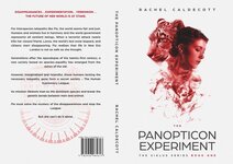
As it stands, the cover is just not right for the genre and age group (totally my mistake). I'm also attaching it for reference.
Thank you all in advance.
 

Attachments

  • Author ramps up.docx
    Author ramps up.docx
    13.6 KB · Views: 9
  • Notes for The Panopticon Experiment.docx
    Notes for The Panopticon Experiment.docx
    13.4 KB · Views: 7
  • characters Panopticon.jpg
    characters Panopticon.jpg
    37.4 KB · Views: 16
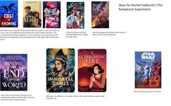
  • cover ideas for Miblart2.jpg
    cover ideas for Miblart2.jpg
    43.8 KB · Views: 17
  • ideas for cover for MiblArt1.jpg
    ideas for cover for MiblArt1.jpg
    56.1 KB · Views: 18
  • Panopticon cover as it is.jpg
    Panopticon cover as it is.jpg
    47.1 KB · Views: 16
Will follow with interest since I am just dipping my toe in the cover dilemma. I did used to work for magazines so get the visual needs. Personally I think YA needs to go back to illustrating copy like in 19th century books. I can see the cover now is beautiful but muddies the character and the concept.
 
Hi Rachel, what a great premise! Have not read it before but happy to comment. What kind of feedback are you looking for? Line edits or overall story thrust?
 
I'm not arty, but maybe have the girl and her mammal-friend looking at each other from either side of the cover, forefront, with a background of some kind of lab inbetween.

I mainly like your book description. I've just commented on little issues.
 

Attachments

Hi Rachel, what a great premise! Have not read it before but happy to comment. What kind of feedback are you looking for? Line edits or overall story thrust?
Thanks. Anything that springs to mind, I guess. I'm hopeless at selling my ideas (in fact I'm sure that my inability to write a good cover letter to agents resulted in having to self-publish).
The book is out there and got some wonderful reviews when I first published it, but none from the YA market. Shortly after publication, Amazon removed it from sale because of, they said, an "issue with the barcode". They didn't tell me and I only discovered by chance that it was 'pending' on KDP rather than 'published' when I went to upload another book onto my author's dashboard. Amazon apologised, but after 18 months off the shelves, it was too late.
However, I think my problem is more fundamental than barcodes. As Pamela Jo says, the current cover is lovely but muddies the concept. I want to give the book one more fighting chance to reach a YA audience. So that means a different, more active/eye-catching cover, and a description that sounds more like an adventure.
Any feedback is welcome.
 
Will follow with interest since I am just dipping my toe in the cover dilemma. I did used to work for magazines so get the visual needs. Personally I think YA needs to go back to illustrating copy like in 19th century books. I can see the cover now is beautiful but muddies the character and the concept.
All the experts say that you need to have a cover that represents the genre. The art team at MIBL even used my cover as an example on their website of a risky one. One that bucked the trend and was a gamble. However, as a group of designers, I find them very good, affordable and a pleasure to work with, so I would recommend them.
 
I'm not arty, but maybe have the girl and her mammal-friend looking at each other from either side of the cover, forefront, with a background of some kind of lab inbetween.

I mainly like your book description. I've just commented on little issues.
Hannah, as usual, all good points. Especially in the description piece. Too late to rewrite the world I've created. But when it comes to horse dung, the Guild of Composters sorts that out ;)
 
The only thing I would say about your book description is that it needs to be more specific in your stakes. Threats and bad guys are implied but I dont have a clear view of them and how they can present such a regime changing danger. If your antagonists are the equivalent of the moustache twirling villain in a potboiler then I think it means we can't really see your stakes as real. Maybe work on picturing your antagonists and that will give you the clue to the cover. Your protagonists leopard and human have to be seen against the backdrop of the danger the antagonists provide.
 
Hi Rachel, I don't know much about YA but instinct tells me your main POV character must lead us into the story. I've made a suggestion in the attached. Not sure it's the right one but just to demonstrate how it might provide more of a hook. Plus a lot of line edits because, well...that's me. For what it's worth! ;)
 

Attachments

Don't know anything about YA, but I wonder if the characters should be introduced sooner in the description.

Thanks for sharing your input to the designer. Many talk about the importance of the brief you give to a designer, but I haven't found a lot of examples out there. I did recently find a book by designer and author Jessica Bell called Can You Make The Tittle Bigga for authors working with designers. It includes the questionnaires she sends to her client.
 
Hi Rachel, I don't know much about YA but instinct tells me your main POV character must lead us into the story. I've made a suggestion in the attached. Not sure it's the right one but just to demonstrate how it might provide more of a hook. Plus a lot of line edits because, well...that's me. For what it's worth! ;)
Very good input, thanks.
 
The only thing I would say about your book description is that it needs to be more specific in your stakes. Threats and bad guys are implied but I dont have a clear view of them and how they can present such a regime changing danger. If your antagonists are the equivalent of the moustache twirling villain in a potboiler then I think it means we can't really see your stakes as real. Maybe work on picturing your antagonists and that will give you the clue to the cover. Your protagonists leopard and human have to be seen against the backdrop of the danger the antagonists provide.
good points, thanks
 
Status
Not open for further replies.
Back
Top