- Thread starter
- #31
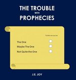
Ah, damn lol.i actually LOVE this design!! my only recommendation is my personal preference for the blue-and-yellow color scheme from one of the previous designs. but this is a very friendly cover that lots of MG-age readers would pick up eagerly")
This is definitely not an MG story lol.
It's for adults. The jokes and subject matter and such are definitely not kid friendly haha. We're not talking R rated or 18+, but it's certainly unsuitable for children.