Navigation
Install the app
How to install the app on iOS
Follow along with the video below to see how to install our site as a web app on your home screen.
Note: This feature may not be available in some browsers.
More options
You are using an out of date browser. It may not display this or other websites correctly.
You should upgrade or use an alternative browser.
You should upgrade or use an alternative browser.
Amusement Been having a play...
- Thread starter Jake E
- Start date
- Status
- Not open for further replies.
Pamela Jo
Full Member
- Oct 26, 2021
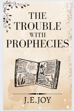
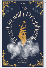
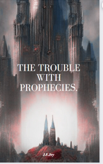
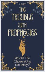
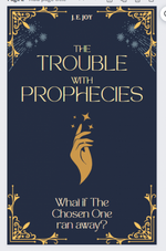
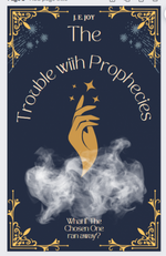
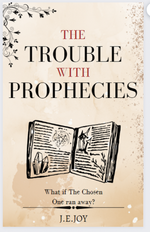
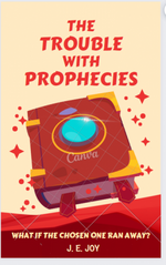
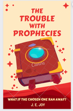
The problem with the middle one is that your eye has to go from The all the way down to Trouble. Watch the way print leads your eye. For that reason I like the first-but add a pop of colour. Maybe in the book? The 3rd is a bit generic and outdated.
- Nov 10, 2017
Left one.
What genre is it? Isn't it SIFI? If so, you might want to reflect that.
What genre is it? Isn't it SIFI? If so, you might want to reflect that.
- Thread starter
- #6
Fantasy this time roundLeft one.
What genre is it? Isn't it SIFI? If so, you might want to reflect that.
- Nov 10, 2017
A link to a pic. It might make a striking cover, esp if you use the tag line of the chosen one running away. If you wanted to use it, you'd have to double check it's really free to use.
- Nov 10, 2017
It's not very fantasy thoughA link to a pic. It might make a striking cover, esp if you use the tag line of the chosen one running away. If you wanted to use it, you'd have to double check it's really free to use.
Vagabond Heart
Full Member
- Feb 21, 2021
Am gonna be v unpopular and say I'm not massively keen on any of them (but I think they are good first tries).
And the reason is this - none of them reflect the humour and style of your book.
Your humour is your USP.
I want a cover that shows that. And also make that tagline much more prominent.
Back (literally) to the drawing board?
xxx
And the reason is this - none of them reflect the humour and style of your book.
Your humour is your USP.
I want a cover that shows that. And also make that tagline much more prominent.
Back (literally) to the drawing board?
xxx
- Thread starter
- #11
Probably.Am gonna be v unpopular and say I'm not massively keen on any of them (but I think they are good first tries).
And the reason is this - none of them reflect the humour and style of your book.
Your humour is your USP.
I want a cover that shows that. And also make that tagline much more prominent.
Back (literally) to the drawing board?
xxx
The trouble is I think to capture the humour, I'm going to need a custom artwork... Which I can't afford.
C
CageSage
Guest
The humour is in the tag-line - make that more prominent.Probably.
The trouble is I think to capture the humour, I'm going to need a custom artwork... Which I can't afford.
I like the first two, but the second one is harder to 'get' the tag-line, and the first one doesn't have it! And the second one has a strange smoke effect.
They're not the worst I've seen (and better than I've done with any of mine).
- Jan 14, 2022
I would go with @Brooke. But maybe just tone down the smoke, not eliminate it, make it a haze. The tag line tells readers the book is humorous and that it addresses serious themes. Can you make the tag line more prominent? Move it into the center of the circle, with the hand pointing up to it?
As the middle cover stands, I would pick up the book and start reading. There is always room for improvement. If you cannot afford custom artwork, then forget about it. You are doing it yourself. You are publishing under a nom de plume, so if the book flops you have lost nothing. If you gain a readership, you have everything.
As the middle cover stands, I would pick up the book and start reading. There is always room for improvement. If you cannot afford custom artwork, then forget about it. You are doing it yourself. You are publishing under a nom de plume, so if the book flops you have lost nothing. If you gain a readership, you have everything.
- Nov 10, 2017
It's good, but ... it still doesn't say fantasy to me. (Nor do the blue ones.) Sorry. I know it's frustrating.
I also wonder if it'll disappear once it's a thumbnail on 'Zon. I suspect it'll fade away against the white of the Zon.
Start with a pic that screams comedy fantasy, then add the text. Look at the fonts that other fantasy books use.
There's no rush. Take your time finding the right one. It'll be out there.
- Thread starter
- #18
Where could I find such a thing?Start with a pic that screams comedy fantasy
- Nov 10, 2017
Any place where they do royalty free pics, i.e. Pixabay. You'll have to do specific searches. Start with 'fantasy' and go from there.
- Nov 10, 2017
And maybe consider saving up some dosh to get one done professionally. Consider it an investment. Or find someone with whom you can trade skills.
It might be worth it in the long-term.
It might be worth it in the long-term.
- Thread starter
- #21
Perhaps.And maybe consider saving up some dosh to get one done professionally. Consider it an investment. Or find someone with whom you can trade skills.
It might be worth it in the long-term.
it'll be a hell of a long time before I've got enough to pay a professional. Several months at least, and only if nothing unexpected comes up.
I also don't have any skills to trade lol.
I shall struggle on.
- Thread starter
- #23
I am torn.i actually really do love the new blue one-- i think it captures the energy of your book very well.
different people will have different opinions on your cover, but it's important to know that people don't only judge a book by its cover!
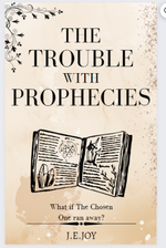
My wife likes the one with the spell book on (she reads a lot of fantasy), but she's not my target audience (She hates Pratchett and Gaiman).
I don't know if I like any of them at present. I did when I made them, but after discussion here, I think there may be better options.
I think the main issue is that I don't have a clear vision for what I want. I'm just throwing things at the wall to see what sticks.
i think the important thing is that you like the finished product. you don't want to finally hold your book in your hands, the thing you've worked on for years, and be unhappy with its cover because others like it. it's your book, and you know it better than anyone, so IMHO, your opinion trumps anyone else's for this! keep drafting ideas, and when you hit on one that you really like, stick with it. you owe it to yourself after all this work to give yourself something you like.I think the main issue is that I don't have a clear vision for what I want. I'm just throwing things at the wall to see what sticks.
- Thread starter
- #25
I mean, yes. Lol.i think the important thing is that you like the finished product. you don't want to finally hold your book in your hands, the thing you've worked on for years, and be unhappy with its cover because others like it. it's your book, and you know it better than anyone, so IMHO, your opinion trumps anyone else's for this! keep drafting ideas, and when you hit on one that you really like, stick with it. you owe it to yourself after all this work to give yourself something you like.
But I'm not the one who's going to buy it. It needs to appeal to others.
of course, yes, that too. so... healthy middle! or as close to a healthy middle as you can get!I mean, yes. Lol.
But I'm not the one who's going to buy it. It needs to appeal to others.
C
CageSage
Guest
I like them, but the book one needs a darker background so it doesn't disappear into the white background at Zon. To me, they do say fantasy trope. The cover isn't for you, or what you think it should say about the story. It's about how to catch the reader. What is your target audience? Would they like it? Do you have a social presence, and can you post the examples there to ask for feedback? You may be surprised.
Also, look up covers in Zon for that genre/subgenre/sub-subgenre and see what they've got. You might also note that the Pratchett covers are not like the others - but don't get too carried away with being different.
Remember, the humour is on the inside, and the category and keywords are what is found when browsers search.
The blue says fantasy to me. It reminds me of Naomi Novik, one of fantasy's bestselling authors, here:
@CageSage is asking the questions you need to answer. You're heading in the right direction.
A Deadly Education: TikTok made me read it : Novik, Naomi: Amazon.com.au: Books
A Deadly Education: TikTok made me read it : Novik, Naomi: Amazon.com.au: Books
www.amazon.com.au
@CageSage is asking the questions you need to answer. You're heading in the right direction.
i actually LOVE this design!! my only recommendation is my personal preference for the blue-and-yellow color scheme from one of the previous designs. but this is a very friendly cover that lots of MG-age readers would pick up eagerlyView attachment 15435View attachment 15436
Not sure if these scream MG too much.
What do you guys think?
- Status
- Not open for further replies.
