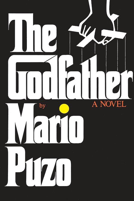
It’s the opposite of subtle, which is entirely right for a novel about the Mob. The definitive novel about the Mob. Very confident design – event publishing.
It’s another “Big Book” design as originated by Paul Bacon (see his design for “Jaws” here) which is very typical of that era. But I don’t believe the essential concept is actually dated at all (large bold title, prominent author's name, with a small conceptual image). It can still work brilliantly for the right book.
Funnily enough, I suspect the conceptual image part of this design is actually the weakest part, the most dispensible. The font is so strong and recognizable – brutal, even – that it says everything that needs saying.
I think other editions may have used imagery from the movie – there’s lots of memorable imagery in it – but my feeling would be to keep it big, bold and clean. The stark black and white nature of the cover hints at the universe of good-and-evil inside.
This site uses cookies to help personalise content, tailor your experience and to keep you logged in if you register.
By continuing to use this site, you are consenting to our use of cookies.